pacman::p_load(jsonlite, tidyverse, tidygraph, ggraph, igraph, plotly, visNetwork, heatmaply, treemap, treemapify, gganimate, patchwork, scales)

options(scipen = 999) #disables scientific notationTake Home Exercise 2
Mini Challenge 2 of VAST Challenge 2023
1. Background
FishEye International is helping the country of Oceanus in identifying companies that has possible engaged in illegal, unreported, and unregulated (IUU) fishing. FishEye has transformed the trade (import/export) data for Oceanus’ marine and fishing industries and transformed it into a knowledge graph. Using this knowledge graph, they hope to understand business relationships, including finding links that will help them stop IUU fishing and protect marine species that are affected by it.
With reference to Mini-Challenge 2 of VAST Challenge 2023 and by using appropriate static and interactive statistical graphics methods, this analysis seek to help FishEye identify companies that may be engaged in illegal fishing by focusing on below tasks:
Use visual analytics to identify temporal patterns for individual entities and between entities in the knowledge graph FishEye created from trade records and (in an attempt to dive deeper) evaluating which the sets of predicted knowledge graph links FishEye has provided are the most reliable.
2. Data
The trade data are stored in below files:
Main Graph
mc_challenge_graph.json- It is the main knowledge graph that contains the trade data. It is a directed multi-graph that contains 34,552 nodes and 5,464,092 edges. Below are the attributes:Node Attributes
Attributes Description id Name of the company that originated (or received) the shipment shpcountry Country the company most often associated with when shipping rcvcountry Country the company most often associated with when receiving dataset Always ‘MC2’ Edge Attributes
Attributes Description arrivalDate Date the shipment arrived at port in YYYY-MM-DD format hscode Country the company most often associated with when shipping valueofgoods_omu Country the company most often associated with when receiving weightkg Always ‘MC2’ dataset Always ‘MC2’ type Always ‘MC2’ generated_by Always ‘MC2’ volumeteu Always ‘MC2’
Bundles
In addition, 12 bundles, that represent the outputs of an AI program for link inference, are also provided. Each bundle represents a list of potential edges to be added to the Main Graph. The bundles includes: carp, catfish, chub_mackerel, cod2, herring, lichen, mackerel, pollock, salmon, salmon_wgl, shark, tuna.
Each bundle output contains similar graph structure as the Main Graph.
3. Data Preparation
3.1 Install R Packages
The R packages are installed using pacman::p_load(). Below is a list of main packages installed:
jsonlite: Lightweight JSON encoder and decoder for R.
tidygraph: Tidy interface for graph manipulation and analysis.
tidyverse: Comprehensive collection of data manipulation and visualization packages.
ggraph: Builds on top of ggplot2 package nad provides a grammar of graphics for plotting graphs and networks.
igraph: Network analysis and visualization
plotly: Interactive data visualization package for creating dynamic charts.
ggstatsplot: Enhances ggplot2 with statistical visualization capabilities.
visNetwork: Interactive network visualizations.
heatmaply: Interactive heatmaps with plotly.
treemap: Visualize hierarchical data using nested rectangles.
treemapify: Create treemaps with ggplot2.
gganimate: Creates animated plots using ggplot2.
Tip
As the numeric values of the following data set are huge, options(scipen = 999) allows setting of the display format for numeric values. It prevents R from automatically switching to scientific notation.
3.2 Loading Data
As the datasets provided are in json format, fromJSON function from jsonlite package will be used to import the data. The Main Graph will be imported first, followed by the individual bundles.
3.2.1 Main Graph
mc2_data <- fromJSON("data/mc2_challenge_graph.json")
glimpse(mc2_data)
List of 5
$ directed : logi TRUE
$ multigraph: logi TRUE
$ graph : Named list()
$ nodes :'data.frame': 34576 obs. of 4 variables:
..$ shpcountry: chr [1:34576] "Polarinda" NA "Oceanus" NA ...
..$ rcvcountry: chr [1:34576] "Oceanus" NA "Oceanus" NA ...
..$ dataset : chr [1:34576] "MC2" "MC2" "MC2" "MC2" ...
..$ id : chr [1:34576] "AquaDelight Inc and Son's" "BaringoAmerica Marine Ges.m.b.H." "Yu gan Sea spray GmbH Industrial" "FlounderLeska Marine BV" ...
$ links :'data.frame': 5464378 obs. of 9 variables:
..$ arrivaldate : chr [1:5464378] "2034-02-12" "2034-03-13" "2028-02-07" "2028-02-23" ...
..$ hscode : chr [1:5464378] "630630" "630630" "470710" "470710" ...
..$ valueofgoods_omu: num [1:5464378] 141015 141015 NA NA NA ...
..$ volumeteu : num [1:5464378] 0 0 0 0 0 0 0 0 0 0 ...
..$ weightkg : int [1:5464378] 4780 6125 10855 11250 11165 11290 9000 19490 6865 19065 ...
..$ dataset : chr [1:5464378] "MC2" "MC2" "MC2" "MC2" ...
..$ source : chr [1:5464378] "AquaDelight Inc and Son's" "AquaDelight Inc and Son's" "AquaDelight Inc and Son's" "AquaDelight Inc and Son's" ...
..$ target : chr [1:5464378] "BaringoAmerica Marine Ges.m.b.H." "BaringoAmerica Marine Ges.m.b.H." "-15045" "-15045" ...
..$ valueofgoodsusd : num [1:5464378] NA NA NA NA NA ...Using glimpse() function of the dplyr package, it can be observed that it is a directed multigraph with a nodes and links dataframes. Hence, in the following data wrangling steps, the two dataframes would be extracted individually.
3.3 Data Wrangling
3.3.1 Tibble Dataframe - Main Graph
Below code chunks are used to extract the nodes and edges data tables from the mc2_data list object and saving the outputs in a tibble data frame object named mc2_nodes and mc2_edges_raw respectively.
#Extracting Nodes
mc2_nodes <- as_tibble(mc2_data$nodes) %>%
  select(id, shpcountry, rcvcountry)
#Extracting edges
mc2_edges_raw <- as_tibble(mc2_data$links) %>%
select(source,target,arrivaldate, hscode,valueofgoods_omu,
volumeteu, weightkg, valueofgoodsusd)
Tip
The select() function is part of the dplyr package and is used to select specific columns as well as re-organise the sequence of the table.
3.3.2 Other data pre-processing
Below are the other data wrangling steps before preparing the data.
Firstly, duplicated data from both mc2_nodes and mc2_edges_raw tibble dataframe are removed using duplicated() function.
# Remove duplicates from nodes dataframe
mc2_nodes <- mc2_nodes[!duplicated(mc2_nodes), ]
glimpse(mc2_nodes)
Rows: 34,576
Columns: 3
$ id <chr> "AquaDelight Inc and Son's", "BaringoAmerica Marine Ges.m.b…
$ shpcountry <chr> "Polarinda", NA, "Oceanus", NA, "Oceanus", "Kondanovia", NA…
$ rcvcountry <chr> "Oceanus", NA, "Oceanus", NA, "Oceanus", "Utoporiana", NA, …# Remove duplicates from links dataframe
mc2_edges_raw <- mc2_edges_raw[!duplicated(mc2_edges_raw), ]
glimpse(mc2_edges_raw)Rows: 5,309,087
Columns: 8
$ source <chr> "AquaDelight Inc and Son's", "AquaDelight Inc and Son…
$ target <chr> "BaringoAmerica Marine Ges.m.b.H.", "BaringoAmerica M…
$ arrivaldate <chr> "2034-02-12", "2034-03-13", "2028-02-07", "2028-02-23…
$ hscode <chr> "630630", "630630", "470710", "470710", "470710", "47…
$ valueofgoods_omu <dbl> 141015, 141015, NA, NA, NA, NA, NA, NA, NA, NA, NA, N…
$ volumeteu <dbl> 0, 0, 0, 0, 0, 0, 0, 0, 0, 0, 0, 0, 0, 0, 0, 0, 0, 0,…
$ weightkg <int> 4780, 6125, 10855, 11250, 11165, 11290, 9000, 19490, …
$ valueofgoodsusd <dbl> NA, NA, NA, NA, NA, NA, 87110, 188140, NA, 221110, 58…The mc2_nodes data frame has no duplicates whereas the mc2_edges_raw data frame was de-duplicated from 5,464,378 rows to 5,309,087 unique rows.
Tip
The above uses the duplicated() function to identify duplicated rows, and the ! operator is used to select the rows that are not duplicated, keeping only the first occurence of each unique row. Another alternative is to use distinct()function from the dplyr package. Both achieve the same outcome, except the distinct() is typically used when creating a new dataframe.
Next, considering value of goods fields would be an important edge metrics to analyse, we shall remove rows that have NA values for both valueofgoods_omu and valueofgoodsusd, considering we yet to know the difference of both and assuming every row should have either one.
is.na() function to identify rows with NA values, and the ! operator is used to select the rows that have no NA values.
# Remove records with NA values in both 'valueofgoods_omu' and 'valueofgoodsusd' columns
mc2_edges_raw <- mc2_edges_raw[!(is.na(mc2_edges_raw$valueofgoods_omu) & is.na(mc2_edges_raw$valueofgoodsusd)), ]
Next, we want to add the shipping country and receiver country of the source company and target company of each edges respectively into the mc2_edges_raw dataframe. To do this, we perform a two-step processing using merge() function where we join both the mc2_nodes dataframe to mc2_edges_raw dataframe on the id column of the former, and the target column of the latter. This creates a new dataframe called mc2_edges_merge_rcr. Next, we do the same with mc2_nodes and the new mc2_edges_merge_rcr, but this time joining on the source column. Since we joined the dataframes twice, the 2 additional columns added are removed.
# Left join mc2_nodes to mc2_edges_raw to add receiver country (shipping country is removed here as it is the shipping country of the target company)
mc2_edges_merge_rcr <- merge(mc2_edges_raw, mc2_nodes, by.x = "target", by.y = "id", all.x = TRUE)[,-c(9)]
# Left join mc2_nodes to mc2_edges_merge_rcr to add shipping country (receiver country is removed here as it is the receiver country of the source company)
mc2_edges_merge_shp <- merge(mc2_edges_merge_rcr, mc2_nodes, by.x = "source", by.y = "id", all.x = TRUE)[,-c(11)]
Tip
The above uses the merge() function to perform the left join operation instead of left_join() function in dplyr package. This is because left_join() requires both tables to be joined on a common column. In our case, we require the mc2_node’s id column to be left joined to source and target column of mc2_edges_raw respectively. Hence merge() is more appropriate here.
Lastly, we performed below steps on the edges table:
filter()is used to select records where either the shipping or receiver country is “Oceanus”. As the purpose of the case at hand is to analyse for the Country of Oceanus, we presume only the shipping trade records that involved Country of Oceanus are pertinent here.rename()is used to rename the generic column name rcvcountry.x to rcvcountrymutate()is used several times to create derived fields as well as convert the data formatymd()oflubridatepackage is used to covert arrivaldate field from character data type into date data typeformat()is used to convert ArrivalDate field into year and month values separately`substr()`is used to extract the first 2 digits of HSCode field, which is used to group the Chapters of the HSCodes.as.factor()is then used to convert it to a factor format.
select()is used not only to select the field needed but also to re-ogranise the sequence of the fields.
mc2_edges <- mc2_edges_merge_shp %>%
  filter(rcvcountry.x == "Oceanus" | shpcountry == "Oceanus") %>% #removing rows where the target or source companies' associated country are not 'Oceanus'
  rename(rcvcountry = rcvcountry.x)%>% #renaming default column name resulted from merge() function in previous step
  mutate(ArrivalDate = ymd(arrivaldate)) %>% #convert the arrival date to a date format
  mutate(Year = format(ArrivalDate, "%Y")) %>% #extract the year from the arrival date
  mutate(month = format(ArrivalDate, "%b"))%>% #extract the month from the arrival date
  mutate(hscode_2digits = as.factor(substr(hscode,1,2))) %>% #extract the year from the arrival date
  mutate(hscode = as.factor(hscode))%>% #convert hscode to factor format
  select(source, target, ArrivalDate, Year, month, hscode, hscode_2digits, valueofgoods_omu,
         volumeteu, weightkg, valueofgoodsusd, shpcountry, rcvcountry) #select the columns that we want to keep
4.Exploratory Data Analysis
In this section, we perform some exploratory data analysis (EDA) to further understand the data.
4.1 Main Graph
4.1.1 HScodes and Importers/Exporters over the years
From the plot below, it could be observed that there are about 3000-4000 HSCodes every year, and more than 9000 importers{style=“color:#CF9A7A;”}/exporters{style=“color:#8EA8BD;”} on a yearly basis. Hence it could be quite difficult to derive any meaningful analysis if the entire dataset is plotted in a graph. In addition, the data is stretched from a 6-year period from 2028 to 2034.
ggplot() function is used to initialise the bar chart, and the 2 charts are combined to a composite figure using patchwork, a ggplot2 extension.
Show the code
# Create a bar plot
hscodes_p1 <- mc2_edges %>%
  group_by(Year) %>%
  summarize(num_hscodes = n_distinct(hscode))%>%
  ggplot(aes(x = Year, y = num_hscodes)) +
  geom_bar(stat = "identity", fill = '#808de8') +
  labs(x = "Year", y = "Number of HSCodes", subtitle = "Number of HSCodes per Year") +
  theme_minimal()+
  theme(panel.grid.major = element_blank(),  # Remove vertical gridlines
        panel.grid.minor = element_blank(),  # Remove horizontal gridlines
        plot.subtitle = element_text(color = "dimgrey", size = 12, hjust = 0.5,face = 'bold'))  # Center the ggtitle

trade_p2 <- mc2_edges %>%
  group_by(Year) %>%
  summarize(num_importers = n_distinct(target),
            num_exporters = n_distinct(source))%>%
  ggplot(aes(x = Year)) +
  geom_bar(aes(y = num_importers), stat = "identity", fill = "#CF9A7A") +
  geom_bar(aes(y = num_exporters), stat = "identity", fill = "#8EA8BD") +
  labs(x = "Year", y = "Count", subtitle = "Number of Importers & Exporters\nOver the Years")+
  theme_minimal()+
  theme(panel.grid.major = element_blank(),  # Remove vertical gridlines
        panel.grid.minor = element_blank(),  # Remove horizontal gridlines
        plot.subtitle = element_text(color = "dimgrey", size = 12, hjust = 0.5,face = 'bold'))  # Center the ggtitle

hscodes_p1 + trade_p2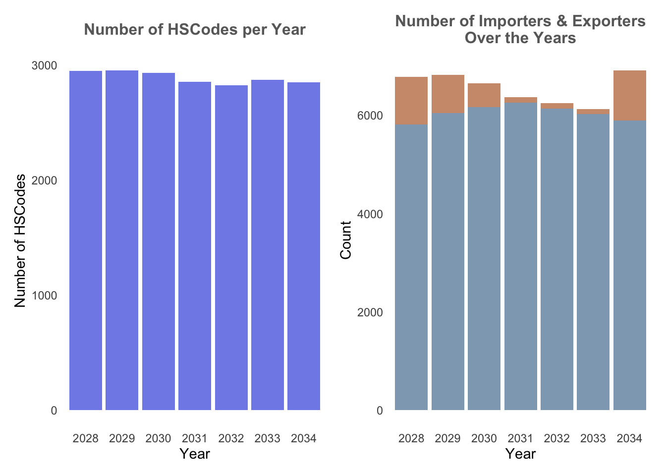
4.1.2 Trade Records
Next, we’re interested to find out the number of trade records that occured throughout the years. Particularly, we would like to find out which particular Year or Month have the higher trade records and if there are any temporal patterns. In order to visualise this trend, we’ve opt to use Heatmap.
In order to plot a heatmap, we first need to transform the data in the data fram into a data matrix using data.matrix(). heatmaply is then used to build an interactive heatmap. In our case below, clustering of the transactions throughout the year is not of utmost importance, hence we have remove the clustering of heatmaply by setting dendrogram = "none".
From the Trade Records heatmap, it could be observed that number of trade records are highest in Year 2030, and there seem to be a decreasing number of transactions over the years after. Particularly, trade records are highest on Aug 2030.
Show the code
## Heatmap of trade records over the months

# Count the number of transactions per month and year
transactions_count <- mc2_edges %>%
  group_by(month, Year) %>%
  summarize(count = n())

# Reshape the data to wide format for heatmap
heatmap_data <- transactions_count %>%
  pivot_wider(names_from = Year, values_from = count, values_fill = 0)

# Convert the data to a matrix using data.matrix
heatmap_matrix <- data.matrix(heatmap_data)

# Create a separate matrix or data frame with custom tooltip text
tooltip_text <- data.matrix(paste("Year:", colnames(heatmap_data)[-1], "\nMonth:", heatmap_data$month))

# Create the interactive heatmap using heatmaply
heatmaply(heatmap_matrix[, -c(1)], #remove first column
          dendrogram = "none", #remove cluster
          colors = Blues,
          margins = c(NA,200,60,NA),
          fontsize_row = 8,
          fontsize_col = 8,
          main="Trade Records over the years",
          xlab = "Months",
          ylab = "Years",
          )
4.1.3 Weight vs Volume
Next, in order to identify which HSCodes are of particular meaning, we plotted a scatterplot of the median weight of the HSCodes vs median Value of goods to observe if there are any particular insights that could be drawn. This is plotted following the assumption that HSCodes with highest value and lowest weight would be more incentivising for companies to partake in illegal trading.
HSCodes of Chapter 29 here stands out the most as the highest value and lowest weight.
Show the code
# Creating separate datatable
hscodes_breakdown <- mc2_edges %>%
  group_by(hscode_2digits) %>%
  summarize(avg_value = mean(valueofgoodsusd, na.rm = TRUE),
            avg_weight = mean(weightkg, na.rm = TRUE))

#Configuring custom tooltip
hscodes_breakdown$tooltip <- c(paste0("Hscode = ", hscodes_breakdown$hscode_2digits))

# Create the scatter plot
g <- ggplot(hscodes_breakdown, aes(x = avg_weight, y = avg_value, text = tooltip)) +
  geom_point(color = '#3498DB') +
  labs(x = "Weight", y = "Value of Goods") +
  ggtitle("Scatter Plot: Value of Goods vs. Weight") +
  theme_classic()+
  theme(plot.title = element_text(size = 14, face = "bold", hjust = 0.5),
        axis.title = element_text(size = 11),
        axis.text = element_text(size = 11),
        panel.grid.minor = element_blank())+
    scale_y_continuous(labels = label_number(suffix = " M", scale = 1e-6)) + # millions
    scale_x_continuous(labels = label_number(suffix = " M", scale = 1e-6)) # millions


ggplotly(g)
4.1.4 HSCodes Breakdown
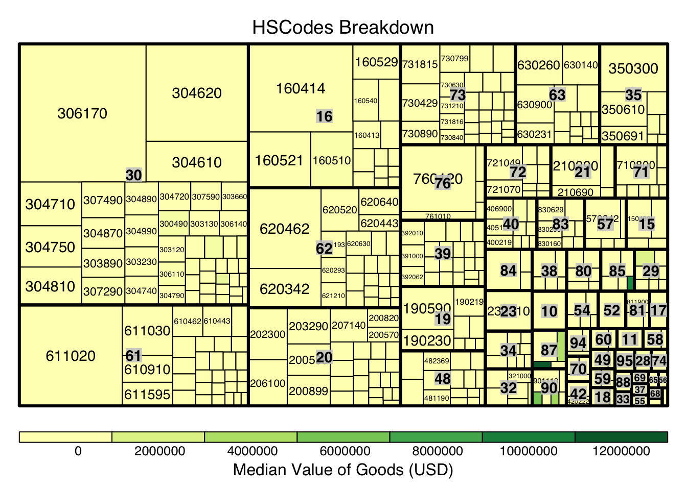
Next, we look to explore and visualise the different types of HSCodes for the trade records, in a bid to understand which HSCodes are most widely used. In order to do so, we will use a Treemap visualisation.
We first perform steps to manipulate and prepare a dataframe that is appropriate for treemap visualisation:
group trade records by HSCode_2digits (HSCodes Chapters) and HSCodes
Compute the number of trade records, median value of goods, and median weight
Next, as there are over 4000 unique HSCodes every year which might not be useful for visualisation, we use quantile to extract the top 10 percentile of HSCodes by trade records. Lastly, we use treemap to create a static treemap, and followed by d3tree() function for an interactive version.
Show the code
#creating a dataframe appropriate for treemap visualtions
hscodes_breakdown <- mc2_edges %>%
  group_by(hscode_2digits, hscode) %>%
  summarise(count = n(),
            Median_Value = median(valueofgoodsusd, na.rm = TRUE),
            Median_weight = median(weightkg, na.rm = TRUE)
            )
hscodes_breakdown <- na.omit(hscodes_breakdown)

# Calculate the threshold for the top 10% count
count_threshold <- quantile(hscodes_breakdown$count, probs = 0.9)

#Filtering only top 10%
hscodes_breakdown_top10 <- hscodes_breakdown[hscodes_breakdown$count >= count_threshold, ]

hscode_tm <- treemap(hscodes_breakdown_top10,
                     index=c("hscode_2digits", "hscode"),
                     vSize="count", #configure size by number of trade records
                     vColor="Median_Value", #configure color by median value of the trade records by HSCode
                     type = "value",
                     title="HSCodes Breakdown",
                     title.legend = "Median Value of Goods (USD)"
                     )
Show the code
library(devtools)
#install_github("timelyportfolio/d3treeR")
library(d3treeR)

d3tree(hscode_tm,rootname = "HSCodes" )
From the above, it can be observe the HSCode Chapter 3 represented the highest number of trade records for the dataset. This could mean that trade records under this Chapter is of particular importance (could mean a commodity like fishes, food, etc.), hence this Chapter could be of particular interest in following analysis.
5. Creating Main Graph
Before we proceed with graph visualisation and analysis, we’d need to prepare the graph data, such as the nodes and edges data.
5.1 Preparing edges data table
Based on the EDA performed in previous section, we will filter the large dataset by HSCode_2digits = 30 and Year = 2030 in order to deep dive further into the interactions between the different nodes.
# filter the edges dataframe to only include the edges that are in the year 2030 and the hscode is 30
mc2_edges_aggregated <- mc2_edges %>%
  filter(hscode_2digits == "30" & Year == "2034") %>%
  group_by(source, target, hscode, Year) %>%
  summarise(weights = n()) %>% # summarise the weights by counting the number of edges
  filter(source!=target) %>%  # filter out the edges that have the same source and target
  filter(weights > 20) %>%  # filter out the edges that have weights less than 20
  ungroup()  # ungroup the dataframe
5.2 Preparing nodes data
Next, we will prepare a new nodes data table that is derived from the source and target fields of mc2_edges_aggregrated data table to ensure that the nodes in the nodes data table include all the source and target values of the edges table.
In below code chunk, we extract the source values and target values from mc2_edges_aggregated data table separately, combined them, and then obtain the unique values using distinct().
Lastly, we filter the original mc2_nodes data table based on this new list, instead of using this new list as the node data so as to still retain the attributes of the nodes which are only available in mc2_nodes.
# extract the source column from the edges dataframe and rename it to id1
id1 <- mc2_edges_aggregated %>%
  select(source) %>%
  rename(id = source)
# extract the target column from the edges dataframe and rename it to id2
id2 <- mc2_edges_aggregated %>%
  select(target) %>%
  rename(id = target)
# combine the id1 and id2 dataframes and remove the duplicates
mc2_nodes_list <- rbind(id1, id2) %>%
  distinct()
# filter the nodes dataframe to only include the nodes that are in the mc2_nodes_list
mc2_nodes_extracted <- mc2_nodes %>%
  filter(id %in% mc2_nodes_list$id)
5.3 Build tidy graph data model
Below code chunk is used to build the tidy graph data model using tbl_graph() function.
# create a graph from the nodes and edges dataframes
mc2_graph <- tbl_graph(nodes = mc2_nodes_extracted,
                       edges = mc2_edges_aggregated,
                       directed = TRUE)
6. Visualisation and Analysis
6.1 Plotting of trade interactions using Eigenvector Centrality
As there are still a huge number of edges and nodes, we will focus only on the top 10% nodes based on their eigenvecotr centrality score. The eigenvector centrality score is first computed within mc2_graph, and the quantile function is used to extract the top 10 percentile of nodes based on the eigenvector centrality score. In addition, to visualise if there are any community among the nodes, we use community detection algorithms built in tidygraph package. In particular, we used group_edge_betweenness() function to identify groups or communities within a network where nodes are more densely connected within the same group than with nodes in other groups. visNetwork() is then use to create an interactive graph. For better visualisation, the top 5 percentile of nodes by Eigenvector centrality score are distinctly coloured.
Show the code
# add a column to the graph that contains the eigen centrality of each node
mc2_graph_eigen <- mc2_graph %>%
  mutate(eigen_centrality = centrality_eigen())

# Filter nodes based on eigen_centrality
top_nodes <- mc2_graph_eigen %>%
  activate(nodes) %>%
  as.data.frame() %>%
  filter(eigen_centrality >= quantile(eigen_centrality, 0.9))

# Filter edges based on top_nodes
mc2_edges_eigen <- mc2_edges_aggregated %>%
  filter(source %in% top_nodes$id | target %in% top_nodes$id)

#Re-extracting nodes from filtered edges
id1_eigen <- mc2_edges_eigen %>%
  select(source) %>%
  rename(id = source)
id2_eigen <- mc2_edges_eigen %>%
  select(target) %>%
  rename(id = target)
mc2_nodes_eigen_list <- rbind(id1_eigen, id2_eigen) %>%
  distinct()
mc2_nodes_extracted_eigen <- mc2_graph_eigen %>%
  activate(nodes) %>%
  as.data.frame() %>%
  filter(id %in% mc2_nodes_eigen_list$id)

# Create the subgraph with top nodes and edges
subgraph <- tbl_graph(nodes = mc2_nodes_extracted_eigen, edges = mc2_edges_eigen, directed = TRUE)

#Creating the edges dataframe
edges_df <- subgraph %>%
  activate(edges) %>%
  as.tibble()

#Creating the nodes dataframe
nodes_df <- subgraph %>%
  mutate(community = group_edge_betweenness(weights = weights, directed = TRUE)) %>% #computing community score
  activate(nodes) %>%
  as_tibble() %>%
  rename(name = id) %>%
  mutate(id=row_number())


#Manual configuration of the nodes' attribute for graph visualisation
nodes_df <- nodes_df %>%
  mutate(color = ifelse(eigen_centrality >= quantile(nodes_df$eigen_centrality, 0.95), "#B7245C", "#395B50"),
         title = paste0("<b><br><span style='color: black;'>",id, ": ", name,"</b></span><p>"),
         label = name,
         size = eigen_centrality*100
         )

#Interactive Graph
visNetwork(nodes_df,
           edges_df,
           height = "500px", width = "100%") %>%
  visIgraphLayout(layout = "layout_with_fr") %>%
  visEdges(arrows =list(to = list(enabled = TRUE, scaleFactor = 2)),
           color = list(color = "gray", highlight = "#7C3238"),
           width = 2
           )%>%
  visNodes(
    borderWidth = 1,
    shadow = TRUE,
  ) %>%
  visOptions(highlightNearest = TRUE,
             nodesIdSelection = TRUE,
             selectedBy ="community", #allow filtering of nodes based on Community
             ) %>%
  visLayout(randomSeed = 123) # to have always the same network
From the above, we could observe that the nodes with the higher eigenvector values (i.e.Mar del Este CJSC, hǎi dǎn Corporation Wharf, Caracola del Sol Services) all have the same traits:
They are all import hubs where they only have in-degree edges.
They are do trades with other companies/nodes with higher eigenvector values.
They belong in the same community (Community = 1)
Tip
Eigenvector centrality (computed using centrality_eigen() function from tidygraph) is a measure of the influence or importance of a node in a network. It takes into account both the node’s direct connections and the connections of its connected partners. This would allow us to observe which company has the highest level of influence in the trade network.
Betweenness centrality (computed using centrality_betweenness() function from tidygraph) is also a relevant centrality measure especially for trade networks. It is calculated by counting the number of shortest paths that pass through that node, and hence is useful to see which companies are critical connectors within the network, which could indicate them being intermediaries or brokers in the shipping network.
A similar plot as done with Betweenness Centrality measure, however, most of the nodes have 0 betweenness centrality score, which could indicate that within this HSCode, the nodes mostly connect with each other. Hence, we will focus more on eigenvector centrality measure.
6.2 Communities within the network
Given the plot from the above graph generated 251 communities, most of each are isolated communities and does not provide much insights, we will further filter the data. In particular, we will filter by HSCode = 306170, the HSCode with the highest number of trade records.
From the below, we can observe the within the HSCodes, there are distinct and clear communities within the network, with a particular community that stands out being the biggest. In addition, there are also other communities that are isolated and not connected to the main network.
Show the code
#Creating a separate edge list filter by hscode = 306170
mc2_edges_hscode<- mc2_edges %>%
  filter(hscode == "306170" & Year == "2030") %>%
  mutate(Year = as.factor(Year)) %>% #extract the year from the arrival date
  group_by(source, target, hscode, Year) %>%
    summarise(weights = n()) %>%
  filter(source!=target) %>%
  filter(weights > 20) %>%
  ungroup()

#Extracting Nodes
id1_hscode <- mc2_edges_hscode %>%
  select(source) %>%
  rename(id = source)
id2_hscode <- mc2_edges_hscode %>%
  select(target) %>%
  rename(id = target)
mc2_nodes_hscode <- rbind(id1_hscode, id2_hscode) %>%
  distinct()
mc2_nodes_hscode_extracted <- mc2_nodes %>%
  filter(id %in% mc2_nodes_hscode$id)

# Create the subgraph with top nodes and edges
subgraph_hscode <- tbl_graph(nodes = mc2_nodes_hscode_extracted,
                       edges = mc2_edges_hscode,
                       directed = TRUE)

g <- subgraph_hscode %>%
  mutate(community = as.factor(group_edge_betweenness(weights = weights, directed=TRUE))) %>%
  mutate(id_num=row_number()) %>%
  ggraph(layout = "kk") +
  geom_edge_link(aes(width=weights),
                 alpha=0.2) +
  scale_edge_width(range = c(0.1, 5)) +
  geom_node_point(aes(size=centrality_eigen(), color = community),show.legend = FALSE)+ #set node size by eigenvector score and color by community
  geom_node_text(aes(label = ifelse(centrality_eigen() >= quantile(centrality_eigen(),0.95), id_num, "")), size = 3, nudge_y = 0,fontface = "bold") + #only labelling the top 5 percentile of nodes
  ggtitle("Network Graph of HSCode 306170 in Year 2030")
g + theme_graph() + theme(plot.title = element_text(size = 14, face = "bold", hjust = 0.5))
6.3 Temporal Graph of Top Nodes
To further observe the temporal patterns of the network, we further filter the nodes by the few observable nodes identified in 6.1. Next, we further filter the HSCode by 306170. Lastly, using `gganimate, we plot an animated graph that shows the changes in edges over the years, from Year 2028 to Year 2034.
From the animated chart, it can be observed that the number of edges increased visbily over the years. For example, for 3.Costa de la Felicidad Shipping, it started with one in-degree interaction in year 2028 to numerous in-degree interactions in Year 2034.
Show the code
#Creating a list of top nodes
top_10_percentile_nodes  <- c("Mar del Este CJSC", "Caracola del Sol Services", "hǎi dǎn Corporation Wharf", "Playa de Arena OJSC Express",
               "Costa de la Felicidad Shipping", "Blue Horizon Family &", "Selous Game Reserve S.A. de C.V.",
               "Tripura Market S.A. de C.V.")

#Creating a separate edge list filter by these nodes
mc2_edges_topnodes <- mc2_edges %>%
  filter(source %in% top_10_percentile_nodes | target %in% top_10_percentile_nodes) %>%
  filter(hscode == "306170") %>%
  mutate(Year = as.factor(Year)) %>% #extract the year from the arrival date
  group_by(source, target, hscode, Year) %>%
    summarise(weights = n()) %>%
  filter(source!=target) %>%
  filter(weights > 20) %>%
  ungroup()

#Extracting Nodes
id1 <- mc2_edges_topnodes %>%
  select(source) %>%
  rename(id = source)
id2 <- mc2_edges_topnodes %>%
  select(target) %>%
  rename(id = target)
mc2_topnodes_list <- rbind(id1, id2) %>%
  distinct()
mc2_topnodes_extracted <- mc2_nodes %>%
  filter(id %in% mc2_topnodes_list$id)

# Create the subgraph with top nodes and edges
mc2_graph_topnodes <- tbl_graph(nodes = mc2_topnodes_extracted,
                       edges = mc2_edges_topnodes,
                       directed = TRUE)

#plotting graph
g <- mc2_graph_topnodes %>%
  mutate(community = as.factor(group_edge_betweenness(weights = weights, directed = TRUE))) %>%
  mutate(id_num=row_number()) %>%
  ggraph(layout = "fr") +
  geom_edge_link(alpha=0.3, arrow =arrow(type = "closed")) +
  scale_edge_width(range = c(0.1, 10)) +
  geom_node_point(aes(size = centrality_eigen(), color = ifelse(id %in% top_10_percentile_nodes, "red","grey")),show.legend = FALSE) +
  ggtitle("Interactions of Top Nodes by Year: {closest_state}") +
  geom_node_text(aes(label = ifelse(centrality_eigen() >= quantile(centrality_eigen(),0.95), id_num, "")), size = 3, nudge_y = 0,fontface = "bold")  #only labelling the top 5 percentile of nodes


animated_graph <- g +
  theme(plot.title = element_text(size = 14, face = "bold", hjust = 0.5)) +
  transition_states(Year, transition_length = 1, state_length = 1) +
  enter_fade() +  # Fade in nodes for current year
  exit_fade()  # Fade out nodes for previous years

animate(animated_graph, fps = 10, duration = 10)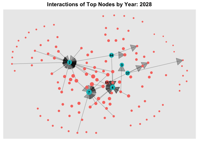
7 Additional Bundles
In the same steps in Section 3, in this section, we’ll perform the same loading and data wrangling of the bundled data.
7.1.1 Loading the data
MC2_carp <- fromJSON("data/bundles/carp.json")
MC2_catfish <- fromJSON("data/bundles/catfish.json")
MC2_chub_mackerel <- fromJSON("data/bundles/chub_mackerel.json")
MC2_cod2 <- fromJSON("data/bundles/cod2.json")
MC2_herring <- fromJSON("data/bundles/herring.json")
MC2_lichen <- fromJSON("data/bundles/lichen.json")
MC2_mackerel <- fromJSON("data/bundles/mackerel.json")
MC2_pollock <- fromJSON("data/bundles/pollock.json")
MC2_salmon_wgl <- fromJSON("data/bundles/salmon_wgl.json")
MC2_salmon <- fromJSON("data/bundles/salmon.json")
MC2_shark <- fromJSON("data/bundles/shark.json")
MC2_tuna <- fromJSON("data/bundles/tuna.json")
7.1.2 Data Wrangling
Similarly, we create the same tibble dataframe for each for the bundle.
MC2_carp_nodes <-as_tibble(MC2_carp$nodes) %>%
  select(id,shpcountry,rcvcountry)
MC2_carp_edges <-as_tibble(MC2_carp$links) %>%
  select(source,target,arrivaldate, hscode,valueofgoods_omu,
         volumeteu, weightkg, generated_by)
MC2_catfish_nodes <-as_tibble(MC2_catfish$nodes) %>%
select(id,shpcountry,rcvcountry)
MC2_catfish_edges <-as_tibble(MC2_catfish$links) %>%
select(source,target,arrivaldate, hscode,valueofgoods_omu,generated_by) #missing volumeteu, weightkgMC2_chub_mackerel_nodes <-as_tibble(MC2_chub_mackerel$nodes) %>%
select(id,shpcountry,rcvcountry)
MC2_chub_mackerel_edges <-as_tibble(MC2_chub_mackerel$links) %>%
select(source,target,arrivaldate, hscode,valueofgoods_omu,
volumeteu, weightkg,generated_by)MC2_cod2_nodes <-as_tibble(MC2_cod2$nodes) %>%
select(id,shpcountry,rcvcountry)
MC2_cod2_edges <-as_tibble(MC2_cod2$links) %>%
select(source,target,arrivaldate, hscode,valueofgoods_omu,
volumeteu, weightkg,generated_by)MC2_herring_nodes <-as_tibble(MC2_herring$nodes) %>%
select(id,shpcountry,rcvcountry)
MC2_herring_edges <-as_tibble(MC2_herring$links) %>%
select(source,target,arrivaldate, hscode,valueofgoods_omu,
volumeteu, weightkg,generated_by)MC2_lichen_nodes <-as_tibble(MC2_lichen$nodes) %>%
select(id,shpcountry,rcvcountry)
MC2_lichen_edges <-as_tibble(MC2_lichen$links) %>%
select(source,target,arrivaldate, hscode,valueofgoods_omu,
volumeteu, weightkg,generated_by)MC2_mackerel_nodes <-as_tibble(MC2_mackerel$nodes) %>%
select(id,shpcountry,rcvcountry)
MC2_mackerel_edges <-as_tibble(MC2_mackerel$links) %>%
select(source,target,arrivaldate, hscode,valueofgoods_omu,generated_by) #missing volumeteu, weightkgMC2_pollock_nodes <-as_tibble(MC2_pollock$nodes) %>%
select(id,shpcountry,rcvcountry)
MC2_pollock_edges <-as_tibble(MC2_pollock$links) %>%
select(source,target,arrivaldate, hscode,valueofgoods_omu,
volumeteu, weightkg,generated_by)MC2_salmon_wgl_nodes <-as_tibble(MC2_salmon_wgl$nodes) %>%
select(id,shpcountry,rcvcountry)
MC2_salmon_wgl_edges <-as_tibble(MC2_salmon_wgl$links) %>%
select(source,target,arrivaldate, hscode,valueofgoods_omu,
volumeteu, weightkg,generated_by)MC2_salmon_nodes <-as_tibble(MC2_salmon$nodes) %>%
select(id,shpcountry,rcvcountry)
MC2_salmon_edges <-as_tibble(MC2_salmon$links) %>%
select(source,target,arrivaldate, hscode,valueofgoods_omu,
volumeteu, weightkg,generated_by)MC2_shark_nodes <-as_tibble(MC2_shark$nodes) %>%
select(id,shpcountry,rcvcountry)
MC2_shark_edges <-as_tibble(MC2_shark$links) %>%
select(source,target,arrivaldate, hscode,valueofgoods_omu,
volumeteu, weightkg,generated_by)MC2_tuna_nodes <-as_tibble(MC2_tuna$nodes) %>%
select(id,shpcountry,rcvcountry)
MC2_tuna_edges <-as_tibble(MC2_tuna$links) %>%
select(source,target,arrivaldate, hscode,valueofgoods_omu,generated_by) #missing volumeteu, weightkg7.1.3 Preparing edges data
In below code chunk, we combined all the 12 bundles into a combined edge data table to facilitate further analysis.
bundle_edges <- bind_rows(MC2_carp_edges,MC2_chub_mackerel_edges,
                        MC2_cod2_edges,MC2_herring_edges,MC2_lichen_edges,
                        MC2_pollock_edges,MC2_salmon_wgl_edges,
                        MC2_salmon_edges,MC2_shark_edges,
                        MC2_catfish_edges,MC2_mackerel_edges,MC2_tuna_edges) %>%
  mutate(ArrivalDate = ymd(arrivaldate)) %>% #convert the arrival date to a date format
  mutate(Year = format(ArrivalDate, "%Y")) %>% #extract the year from the arrival date
  mutate(hscode_2digits = as.factor(substr(hscode,1,2))) %>%
  mutate(month = format(ArrivalDate, "%b"))%>%
  mutate(hscode = as.factor(hscode))
8. Bundles EDA
8.1 Bundle analysis
From below, it can be observed that the bundles output records only have data from 2033-2035, and where only the year 2034 do all the bundle outputs have data. In addition, different bundles have differing number of HSCodes.
Show the code
# Plot for Number of records by year
record_p1 <- bundle_edges %>%
  group_by(generated_by, Year) %>%
  summarise(num_records = n()) %>%
  ggplot(aes(x = Year, y = num_records, fill = generated_by)) +
  geom_bar(stat = "identity", position = "dodge") +
  labs(x = "Year", y = "Number of Records", subtitle = "Data Available by Year\nfor each Bundle output") +
  scale_fill_brewer(palette = "Set3")+
  theme_minimal()+
  theme(panel.grid.major = element_blank(),  # Remove vertical gridlines
        panel.grid.minor = element_blank(),  # Remove horizontal gridlines
        plot.subtitle = element_text(color = "dimgrey", size = 12, hjust = 0.5,face = 'bold'))  # Center the ggtitle

# Plot for number of hscodes per bundle
hscode_p2 <- bundle_edges %>%
  group_by(generated_by) %>%
  filter(hscode_2digits == "30") %>%
  summarise(num_outputs = n_distinct(hscode))%>%
  ggplot(aes(x = generated_by, y = num_outputs,fill = generated_by)) +
  geom_bar(stat = "identity",show.legend = FALSE) +
  labs(x = "Generated By Bundle", y = "Number of Outputs", subtitle = "Number of Outputs\nper HSCodes")+
  scale_fill_brewer(palette = "Set3")+
  theme_minimal()+
  theme(axis.text.x=element_blank(), #remove x-axis label
        panel.grid.major = element_blank(),  # Remove vertical gridlines
        panel.grid.minor = element_blank(),  # Remove horizontal gridlines
        plot.subtitle = element_text(color = "dimgrey", size = 12, hjust = 0.5,face = 'bold'))  # Center the ggtitle

record_p1 + hscode_p2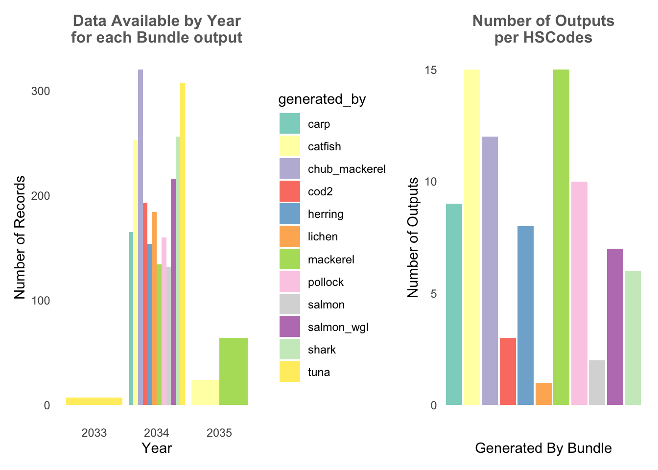
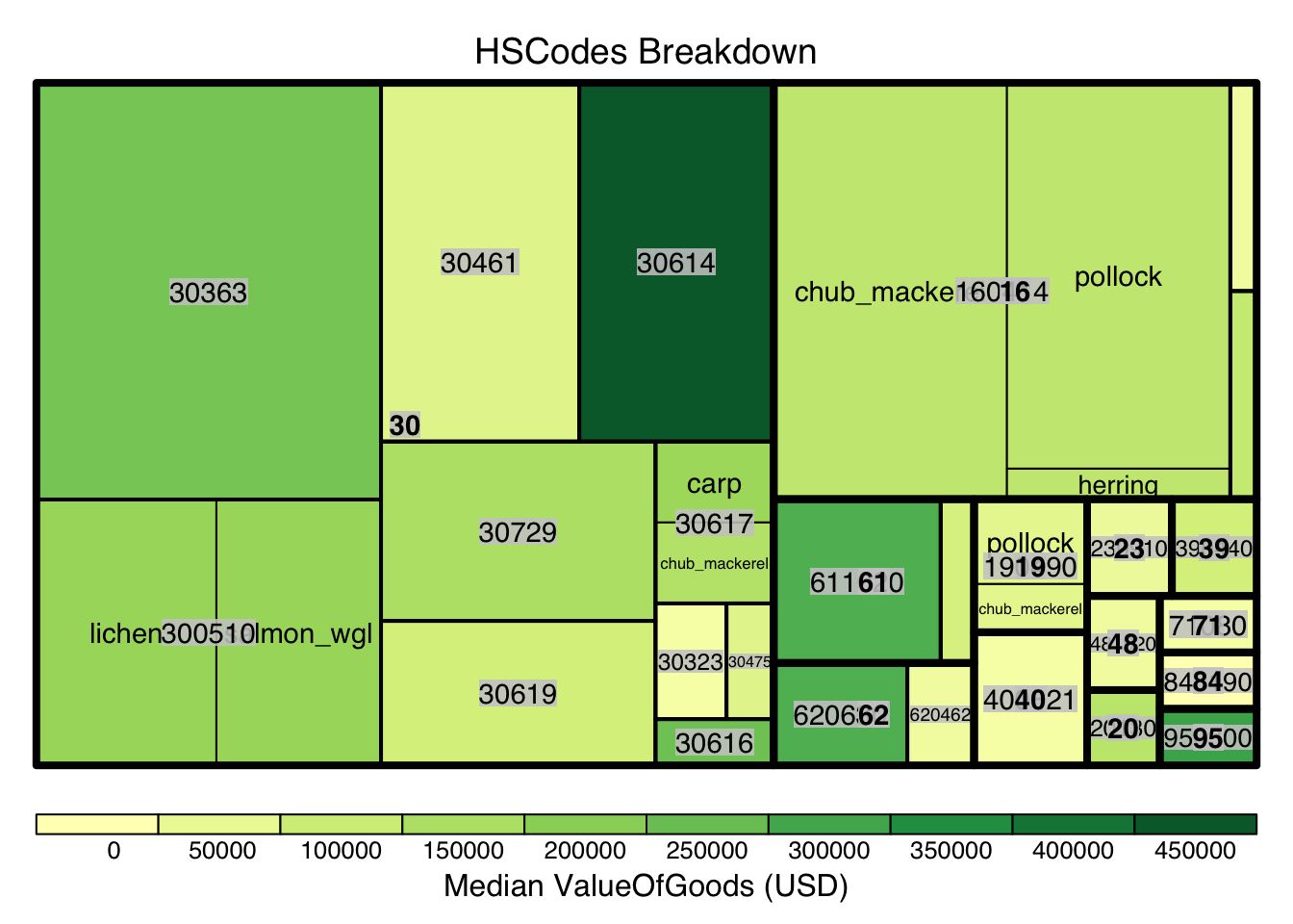
8.2 HSCode Breakdown
Using similar approach from Section 4, we also breakdown the HSCodes for the combined bundled graph data. Similarly, it could be observed that in the bundled data, HSCode Chapter 30 also has the highest record count.
Show the code
#treemap of hscodes
bundle_hscodes <- bundle_edges %>%
  group_by(hscode_2digits, hscode, generated_by) %>%
  summarise(count = n(),
            Median_Value = median(valueofgoods_omu, na.rm = TRUE),
            Median_weight = median(weightkg, na.rm = TRUE)
            )
bundle_hscodes <- na.omit(bundle_hscodes)

# Calculate the threshold for the top 10% count
count_threshold <- quantile(bundle_hscodes$count, probs = 0.9)

#Filtering only top 10%
bundle_hscodes_top10 <- bundle_hscodes[bundle_hscodes$count >= count_threshold, ]

hscode_tm <- treemap(bundle_hscodes_top10,
                     index=c("hscode_2digits", "hscode", "generated_by"),
                     vSize="count",
                     vColor="Median_Value",
                     type = "value",
                     #palette="Blues",
                     title="HSCodes Breakdown",
                     title.legend = "Median ValueOfGoods (USD)"
                     )
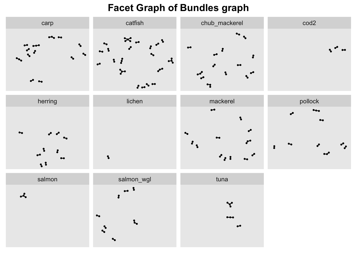
9. Bundles comparison
Next, based on EDA, we know that Year 2034 is the only year where all bundles have data and HSCode Chapter 30 has the highest number of trade records, hence we’ll filter the combined data by these 2 metrics.
In order ot view the graph of the different bundles in a meaningful way, we use facet_nodes() to spread the nodes out based on their attributes - in this case, the bundle name.
To do so, the nodes columns need to be unique, otherwise the resulting facet graph will have missing edges. Hence, we create new columns source_bundle and target_bundle using paste() to concatenate the source/target columns with generated_by column.
Show the code
#Create new combined edge list
bundle_edges_filtered <- bundle_edges %>%
  mutate(source_bundle = paste(source,generated_by))%>% #concat source and generated_by column to create a unique node list
  mutate(target_bundle = paste(target,generated_by))%>% #concat source and generated_by column to create a unique node list
  filter(hscode_2digits == "30" & Year == "2034") %>%
  group_by(source_bundle, target_bundle, hscode, Year, generated_by) %>%
    # summarise the weights by counting the number of edges
  summarise(weights = n())%>%
  # filter out the edges that have the same source and target
  filter(source_bundle!=target_bundle) %>%
  # ungroup the dataframe
  ungroup()

#Extract unique nodes
bundle_source_id <- bundle_edges_filtered %>%
  select(source_bundle, generated_by) %>%
  rename(id = source_bundle)
bundle_target_id <- bundle_edges_filtered %>%
  select(target_bundle,generated_by) %>%
  rename(id = target_bundle)

bundle_nodes <- rbind(bundle_source_id, bundle_target_id)%>%
  distinct(id, generated_by)

bundle_graph <- tbl_graph(nodes = bundle_nodes,
                           edges = bundle_edges_filtered,
                           directed = TRUE)
#Creating a graph
g <- ggraph(bundle_graph,
            layout = "nicely") +
  geom_edge_link(alpha=1,
                 show.legend = FALSE) +
  scale_edge_width(range = c(0.1, 5)) +
  geom_node_point(size = 0.6)+
  ggtitle("Facet Graph of Bundles graph")

#creating a facet graph
g + facet_nodes( ~ generated_by)+ theme(plot.title = element_text(size = 14, face = "bold", hjust = 0.5))