pacman::p_load(tidyverse, ggthemes, plotly, lubridate, ggpubr, ggrepel, gganimate, knitr, ggridges, ggdist, reshape2, ggstatsplot, ggiraph, patchwork, waffle,ggiraphExtra)Take Home Exercise 1
Visual Analytics of participants from City of Engagement
1. Overview
City of Engagement, with a total population of 50,000, is a small city located at Country of Nowhere. The city serves as a service centre of an agriculture region surrounding the city. The main agriculture of the region is fruit farms and vineyards. The local council of the city is in the process of preparing the Local Plan 2023.
A sample survey of 1000 representative residents had been conducted to collect data related to their household demographic and spending patterns, among other things. The city aims to use the data to assist with their major community revitalization efforts, including how to allocate a very large city renewal grant they have recently received.
The task is to reveal the demographic and financial characteristics of the city of Engagement by using appropriate static and interactive statistical graphics methods, using ggplot2, its extensions, as well as tidyverse family of packages.
2. Data
For the purpose of this study, two data sets are provided.
Participants.csv - The data has 1,011 rows and 7 columns.
| Columns | Data Type | Description |
|---|---|---|
| participantId | integer | Unique ID assigned to each participant |
| householdSize | integer | The number of people in the participant’s household |
| haveKids | boolean | Whether there are children living in the participant’s household |
| age | integer | Participant’s age in years at the start of the study |
| educationLevel | string | The participant’s education level, one of: {“Low”, “HighSchoolOrCollege”, “Bachelors”, “Graduate”} |
| interestGroup | char | A char representing the participant’s stated primary interest group, one of {“A”, “B”, “C”, “D”, “E”, “F”, “G”, “H”, “I”, “J”}. Note: specific topics of interest have been redacted to avoid bias. |
| joviality | float | A value ranging from [0,1] indicating the participant’s overall happiness level at the start of the study. |
FinancialJournal.csv - The data has 1,513,636 rows and 4 columns.
| Columns | Data Type | Description |
|---|---|---|
| participantId | integer | Unique ID assigned to each participant |
| timestamp | datetime | The time when the check-in was logged |
| category | string factor | A string describing the expense category, one of {“Education”, “Food”, “Recreation”, “RentAdjustment”, “Shelter”, “Wage”} |
3. Data Preparation
3.1 Install R Packages
The R packages are installed using pacman::p_load(). Below is a list of main packages installed:
tidyverse: Comprehensive collection of data manipulation and visualization packages.plotly: Interactive data visualization package for creating dynamic charts.ggstatsplot: Enhances ggplot2 with statistical visualization capabilities.gganimate: Creates animated plots using ggplot2.ggrepel: Avoids label overlap in ggplot2 plots.ggridges: Creates ridgeline plots in ggplot2.ggiraph: Adds interactivity to ggplot2 plots.waffles: Creates waffle charts for visualizing proportions or percentages.patchwork: Combines multiple ggplot2 plots into a single layout.
3.2 Loading data
Importing both datasets and assigning it to a variable each.
participants <- read_csv("data/Participants.csv")
fin_journal <- read_csv("data/FinancialJournal.csv")
3.2.1 Participants Data
Below show a snippet of the data
participants# A tibble: 1,011 × 7
participantId householdSize haveKids age educationLevel interestGroup
<dbl> <dbl> <lgl> <dbl> <chr> <chr>
1 0 3 TRUE 36 HighSchoolOrCollege H
2 1 3 TRUE 25 HighSchoolOrCollege B
3 2 3 TRUE 35 HighSchoolOrCollege A
4 3 3 TRUE 21 HighSchoolOrCollege I
5 4 3 TRUE 43 Bachelors H
6 5 3 TRUE 32 HighSchoolOrCollege D
7 6 3 TRUE 26 HighSchoolOrCollege I
8 7 3 TRUE 27 Bachelors A
9 8 3 TRUE 20 Bachelors G
10 9 3 TRUE 35 Bachelors D
# ℹ 1,001 more rows
# ℹ 1 more variable: joviality <dbl>3.2.2 FinancialJournal Data
fin_journal# A tibble: 1,513,636 × 4
participantId timestamp category amount
<dbl> <dttm> <chr> <dbl>
1 0 2022-03-01 00:00:00 Wage 2473.
2 0 2022-03-01 00:00:00 Shelter -555.
3 0 2022-03-01 00:00:00 Education -38.0
4 1 2022-03-01 00:00:00 Wage 2047.
5 1 2022-03-01 00:00:00 Shelter -555.
6 1 2022-03-01 00:00:00 Education -38.0
7 2 2022-03-01 00:00:00 Wage 2437.
8 2 2022-03-01 00:00:00 Shelter -557.
9 2 2022-03-01 00:00:00 Education -12.8
10 3 2022-03-01 00:00:00 Wage 2367.
# ℹ 1,513,626 more rows3.3 Data Wrangling
The raw data from both data sets requires additional wrangling and manipulation before they can be processed and analysed further.
3.3.1 Participants Data
is.na() function is used to check if any values are missing from the participants data set. No values are missing.
any(is.na(participants))[1] FALSETo ensure subsequent statistical and categorical data analysis would not encounter problems, it is also best practice to convert variables, especially categorical ones, into factor type.
educationLevel and interestGroup are in
chrtype and is converted tofctr.haveKids is in
lglboolean type. However, we will also convert tofctr.householdSize is in
dbltype. While it is technically accurate, it is not useful for analysis. Hence we will convert tofctrtype.participantId will be converted to
chrtype.
Show the code
# Convert variables to factor type
col <- c("haveKids","educationLevel","interestGroup", "householdSize")
participants <- participants %>%
  mutate_at(col, as.factor) %>%
  mutate(participantId = as.character(participantId))

# Define the custom order of education levels
custom_order <- c("Low", "HighSchoolOrCollege", "Bachelors", "Graduate")

# Convert educationLevel to a factor with custom order
participants$educationLevel <- factor(participants$educationLevel, levels = custom_order)
Tip
To ensure better visual representation, we can explicitly specify the order of education level. This can only be done for fctr data type!
3.3.2 FinancialJournal Data
Similarly, for FinancialJournal dataset, a is.na() function is performed to check for missing values.
any(is.na(fin_journal))[1] FALSE3.3.2.1 Remove duplicates
Next, given that it is a large data set, we shall do a duplicate check using duplicated. There are a total of 1,113 duplicated data.
duplicates <- duplicated(fin_journal)
sum(duplicates)
[1] 1113
Caution
While duplicate checks are important to preserve data integrity, it is important to be careful as not every seemingly duplicated data are duplicates, especially in the absence of a unique id. In the above example, it is also possible for 2 records to be the same but yet distinct in business nature.
As timestamp is the only remotely unique data, we use unique to observe whether duplicated data are sparse across the dates.
distinct_months <- unique(fin_journal[duplicates, "timestamp"])
distinct_months
# A tibble: 1 × 1
timestamp
<dttm>
1 2022-03-01 00:00:00Since all of the duplicated data belongs to the same month, there’s reason to believe they are genuine duplicates.
3.3.2.2 Change data type
As such, we shall create a new clean data set and name it fin_journal_clean. We would also perform some data wrangling by changing the data types of the variables:
- Convert timestamp from
POSIXcttodateformat, keeping only month and year.
fin_journal_clean <- distinct(fin_journal) %>%
  mutate(timestamp = floor_date(timestamp, "month")) %>%
  mutate(timestamp = as.Date(timestamp)) %>%
  mutate(participantId = as.character(participantId))
3.3.2.3 Pivot table
As the fin_journal_clean table is a long vertical table, we will perform a pivot to a horizontal table where each of the expense categories have its own column.
Show the code
#pivot to horizontal table
fin_journal_pivot <- fin_journal_clean %>%
  group_by(participantId, timestamp, category) %>%
  summarize(total_amount = sum(amount)) %>%
  pivot_wider(
    id_cols = c(participantId, timestamp),
    names_from = category,
    values_from = total_amount
  ) %>%
  #for columns that are numeric, replace NA values with 0
  mutate(across(where(is.numeric), ~if_else(is.na(.), 0, .)))
Below is a preview of the pivoted table.
fin_journal_pivot# A tibble: 10,691 × 8
# Groups: participantId, timestamp [10,691]
participantId timestamp Education Food Recreation Shelter Wage
<chr> <date> <dbl> <dbl> <dbl> <dbl> <dbl>
1 0 2022-03-01 -38.0 -268. -349. -555. 11932.
2 0 2022-04-01 -38.0 -266. -219. -555. 8637.
3 0 2022-05-01 -38.0 -265. -383. -555. 9048.
4 0 2022-06-01 -38.0 -257. -466. -555. 9048.
5 0 2022-07-01 -38.0 -270. -1070. -555. 8637.
6 0 2022-08-01 -38.0 -262. -314. -555. 9459.
7 0 2022-09-01 -38.0 -256. -295. -555. 9048.
8 0 2022-10-01 -38.0 -267. -25.0 -555. 8637.
9 0 2022-11-01 -38.0 -261. -377. -555. 9048.
10 0 2022-12-01 -38.0 -266. -357. -555. 9048.
# ℹ 10,681 more rows
# ℹ 1 more variable: RentAdjustment <dbl>3.3.2.4 Missing participants
Below, we do a check to ensure that all participants have provided the necessary data. That is, a reasonableness check that for every participant, there should be the same number of months (12) of data.
Show the code
# Calculate the expected number of months based on the total number of unique months in the dataset
expected_months <- n_distinct(fin_journal_pivot$timestamp)
expected_months
[1] 12We identify and count the number of participants that have less than 12 months of data.
Show the code
# Group the data by participantId and calculate the actual number of months for each participant
participant_months <- fin_journal_pivot %>%
  group_by(participantId) %>%
  summarize(actual_months = n_distinct(timestamp))

# Identify participants with missing data
missing_participants <- participant_months %>%
  filter(actual_months < expected_months)
There are total of 113 participants with data missing in some months. It is believed/assumed that they have dropped out of the data collection.
count(missing_participants)# A tibble: 1 × 1
n
<int>
1 131Hence, we shall remove this participants and their data.
Show the code
fin_journal_pivot_final <- fin_journal_pivot %>%
  anti_join(missing_participants, by = "participantId")
3.3.2.5 Final Wrangling
Finally, we shall perform some final clean-ups. These include:
Remove timestamp column and summarise/group the remaining data. As data are collected upon 12 month period, the time-series data might not be as useful to us. Data can be interpreted on a monthly or annual basis.
Adding expense categories together to form a new variable called total_expenses
Adding income categories together to form a new variable called total_income
Creating a new variable called expense_ratio, which takes total_expenses / total_income
Show the code
fin_journal_pivot_final <- fin_journal_pivot_final %>%
  # removing timestamp column
  select(-matches("timestamp")) %>%
  group_by(participantId) %>%
  summarize_at(vars(Education:RentAdjustment),sum) %>%
  ##Sum total expenses and convert to absolute value
  mutate(total_expenses = abs(Education + Food + Recreation + Shelter)) %>%
  mutate(total_income = RentAdjustment + Wage) %>%
  mutate(Expense_ratio = total_expenses/total_income)
3.3.2.6 Joining data sets
Finally, we combine both data sets to form a unified one combined_pivot_data.
Show the code
combined_pivot_data <- left_join(fin_journal_pivot_final, participants, by = "participantId")Below is a sample of the data:
kable(head(combined_pivot_data), "simple")| participantId | Education | Food | Recreation | Shelter | Wage | RentAdjustment | total_expenses | total_income | Expense_ratio | householdSize | haveKids | age | educationLevel | interestGroup | joviality |
|---|---|---|---|---|---|---|---|---|---|---|---|---|---|---|---|
| 0 | -456.0646 | -3141.976 | -4384.0672 | -6659.863 | 109816.59 | 0 | 14641.971 | 109816.59 | 0.1333311 | 3 | TRUE | 36 | HighSchoolOrCollege | H | 0.0016267 |
| 1 | -456.0646 | -3167.336 | -6637.5107 | -6659.863 | 96374.93 | 0 | 16920.775 | 96374.93 | 0.1755724 | 3 | TRUE | 25 | HighSchoolOrCollege | B | 0.3280865 |
| 10 | -153.7493 | -4741.141 | -3088.0366 | -6730.812 | 79303.82 | 0 | 14713.739 | 79303.82 | 0.1855363 | 3 | TRUE | 48 | HighSchoolOrCollege | D | 0.5571760 |
| 100 | 0.0000 | -3695.506 | -4425.2218 | -7168.445 | 46918.02 | 0 | 15289.173 | 46918.02 | 0.3258700 | 2 | FALSE | 29 | Low | F | 0.1426862 |
| 1000 | 0.0000 | -5987.265 | -6466.7517 | -6199.918 | 29292.89 | 0 | 18653.935 | 29292.89 | 0.6368076 | 1 | FALSE | 56 | Graduate | B | 0.9830125 |
| 1001 | 0.0000 | -3197.202 | -211.6989 | -5464.707 | 46233.82 | 0 | 8873.607 | 46233.82 | 0.1919289 | 1 | FALSE | 49 | Graduate | C | 0.0434335 |
3.3 Summary of Data
There are a total of 1,011 participants interviewed. Below list the summary statistics for each of the variables.
Show the code
#quantitative columns to describe
sel_col <- c("householdSize", "age", "joviality")
#filter dataset
sel_data <- combined_pivot_data %>%
  select(all_of(sel_col))
psych::describe(sel_data)
vars n mean sd median trimmed mad min max range skew
householdSize* 1 880 1.90 0.81 2.00 1.87 1.48 1 3 2 0.19
age 2 880 39.13 12.40 39.00 39.19 16.31 18 60 42 -0.03
joviality 3 880 0.47 0.29 0.44 0.46 0.35 0 1 1 0.22
kurtosis se
householdSize* -1.45 0.03
age -1.21 0.42
joviality -1.14 0.014. Data Visualisation
4.1 Demographics
Below is a high-level overview of the demographics of participants.
Observation:
The age of the participants are relatively evenly distributed across the age ranges, with lowest being 18 and oldest being 60.
Show the code
plot <- ggplot(combined_pivot_data,
       aes(x = age)) +
  geom_histogram(binwidth = 5,
                 fill = "lightblue",
                 color = "black") +
  labs(x = "Age", y = "No. of Participants") +
  ggtitle("Distribution of Age") +
  theme_minimal() +
  theme(panel.grid.major.x = element_blank(), #remove vertical gridlines
        panel.grid.minor.x = element_blank(),
        plot.title = element_text(face = "bold", hjust = 0.5, size = 14))

print(plot)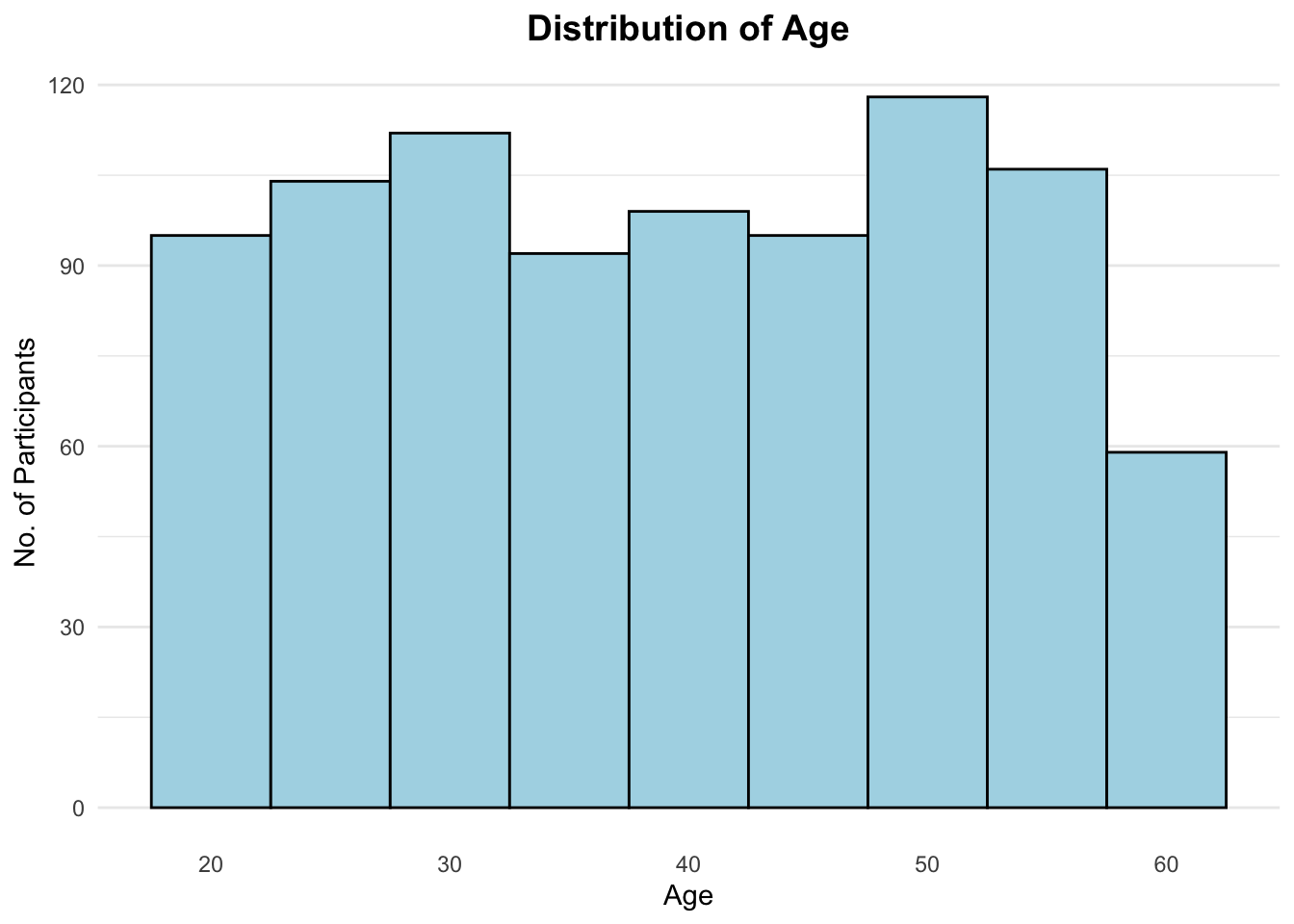
Show the code
print(as.data.frame(psych::describe(combined_pivot_data$age))) vars n mean sd median trimmed mad min max range skew
X1 1 880 39.13068 12.39922 39 39.18608 16.3086 18 60 42 -0.026236
kurtosis se
X1 -1.214038 0.4179775Observation:
10% more participants live alone than have kids (household size more than 1)
Show the code
# Calculate the count and percentage
participants_count <- combined_pivot_data %>%
  group_by(householdSize) %>%
  summarize(
    count = n()
  ) %>%
  mutate(
    householdSize = factor(householdSize),  # Convert to factor
    householdSize_pct = round(count/sum(count)*100)
  )

# Choose a color palette
color_palette <- scales::brewer_pal(type = "qual")(length(unique(participants_count$householdSize)))

# Create the pie chart using ggplot2
pie_chart <- ggplot(participants_count, aes(x = "", y = householdSize_pct, fill = householdSize)) +
  geom_bar(stat = "identity", width = 1, color = "white") +
  coord_polar(theta = "y") +
  scale_fill_manual(values = color_palette, name = 'Household Size') +
  geom_text(aes(label = paste0(householdSize_pct, "%")), position = position_stack(vjust = 0.5), color = "white") +
  labs(title = "Proportion of Household Sizes among participants") +
  theme_void() +
  theme(plot.title = element_text(face = "bold", hjust = 0.5, size = 14))

# Display the pie chart
pie_chart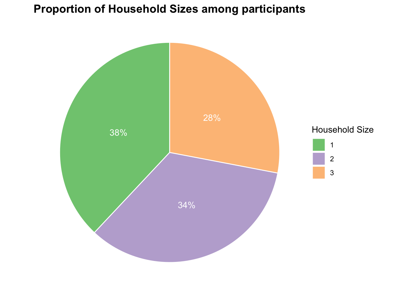
Observation:
We use waffle charts here to illustrate the breakdown of financials by the average participants. Out of total income, most are proportioned to Savings, followed by Shelter expenses, then Recreation, Food and lastly Education.
Show the code
average_participant <- combined_pivot_data %>%
  summarize(
    FoodExpenses = abs(mean(Food)),
    ShelterExpenses = abs(mean(Shelter)),
    EducationExpenses = abs(mean(Education)),
    RecreationExpenses = abs(mean(Recreation)),
    Savings = mean(Wage + RentAdjustment - abs(`Food` + `Shelter`))
  )

# Calculate the proportions of expenses and savings
expenses <- c(average_participant$FoodExpenses, average_participant$ShelterExpenses,average_participant$EducationExpenses, average_participant$RecreationExpenses )
savings <- average_participant$Savings
total <- sum(expenses, savings)
expenses_prop <- expenses / total
savings_prop <- savings / total

# Create a data frame for waffle chart
waffle_data <- data.frame(
  category = c("Food Expenses", "Shelter Expenses", "Education", "Recreation", "Savings"),
  total = c(expenses,savings),
  proportion = c(expenses_prop, savings_prop)
)

# does not work for waffle charts unfortunately
legend_labels <- c("Food Expenses", "Shelter Expenses", "Education", "Recreation", "Savings")

waffle_chart <- waffle(waffle_data$proportion*100, rows = 10, size = 1,
                       colors = c("#F8766D", "#7CAE00", "#00BFC4", "#C77CFF", "#FFB621"),
                       title = list(label = "Financial Breakdown of\n Average Participant", size = 10, face = "bold", hjust = 0.5),
                       pad = 0.3
)
waffle_chart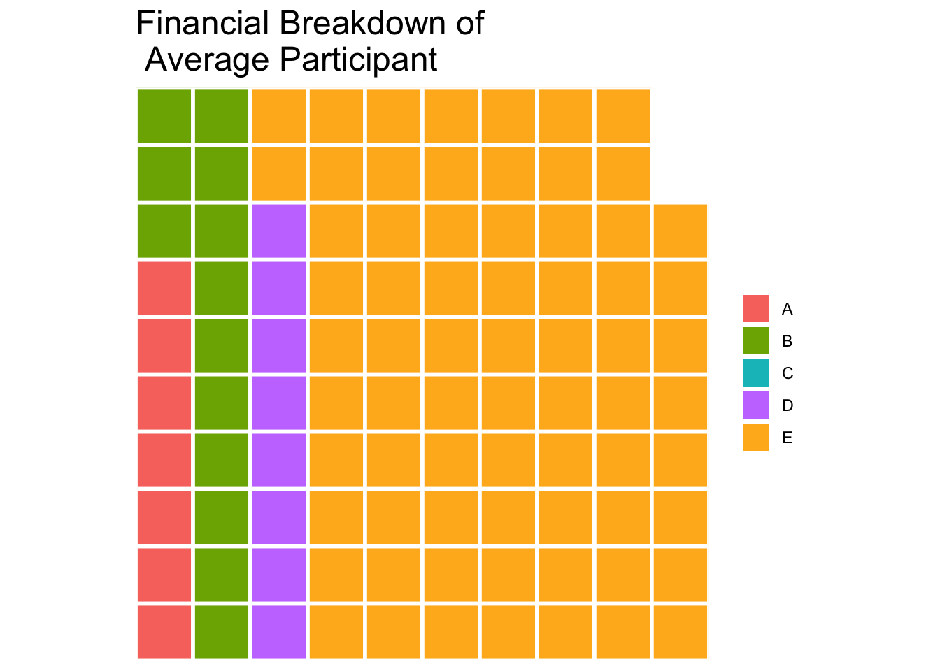
Observation:
47.95% of the participants have High School or College degrees whereas 6.56% of participants have low education level.
Tip
Hover over to see the number of participants and percentage breakdown!
Show the code
# Calculate the count for each education level
education_count <- combined_pivot_data %>%
  group_by(educationLevel) %>%
  summarize(count = n())

# Order the education levels by count
education_count <- education_count[order(education_count$count, decreasing = TRUE), ]

# Calculate percentage
education_count <- education_count %>%
  mutate(percentage = count / sum(count) * 100)

# Create the stacked bar chart using ggplot2
stacked_bar_chart <- ggplot(education_count, aes(x = "", y = count, fill = educationLevel, tooltip = paste("No. of Participants:", count,"<br>Percentage:", round(percentage, 2), "%"))) +
  geom_bar_interactive(stat = "identity", width = 1, color = "white") +
  coord_flip() +
  scale_fill_viridis_d(name = 'Household Size') +
  labs(title = "Education Level Breakdown",
       x = NULL, y = "Count") +
  theme_minimal() +
  theme(legend.position = "bottom",
        plot.title = element_text(face = "bold", hjust = 0.5, size = 14))

# Display the stacked bar chart
girafe(ggobj = stacked_bar_chart,
       width_svg = 6,
  height_svg = 6*0.618)
Observation:
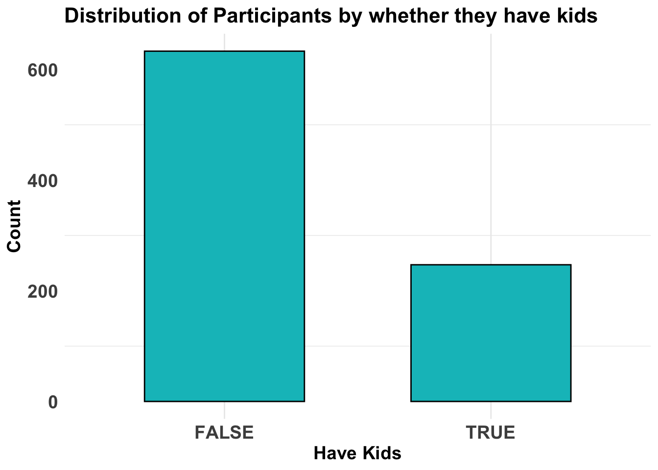
Most of the participants do not have kids.
Show the code
ggplot(data = combined_pivot_data, aes(x = haveKids)) +
  geom_bar(fill = "#00BFC4", color = "black", width = 0.6) +
  labs(x = "Have Kids", y = "Count", title = "Distribution of Participants by whether they have kids") +
  theme_minimal() +
  theme(
    axis.text = element_text(face = "bold", hjust = 0.5, size = 14),
    axis.title = element_text(size = 14, face = "bold"),
    plot.title = element_text(size = 16, face = "bold"),
    panel.grid.major.y = element_blank()
  )
Observation:
Annual Income is left-skewed - which indicates more of the participants have lower income whereas Annual Expenses seem to follow normal distribution.
Show the code
p1 <- ggplot(data=combined_pivot_data,
             aes(x = total_income)) +
  geom_histogram(bins = 20,
                 #boundary = 100,
                 color="grey25",
                 fill="grey90") +
  labs(
    x = "Total Income",
    y = "Count",
    title = "Distribution of Annual Income",
  ) +
  theme_minimal() +
  theme(
    panel.grid = element_blank()
  )

p2 <- ggplot(data=combined_pivot_data,
             aes(x = total_expenses)) +
  geom_histogram(bins = 20,
                 #boundary = 100,
                 color="grey25",
                 fill="grey90") +
  labs(
    x = "Total Expenses",
    y = "Count",
    title = "Distribution of Annual Expenses",
  ) +
  theme_minimal() +
  theme(
    panel.grid = element_blank()
  )

p3 <- ggplot(data=combined_pivot_data,
             aes(x = Expense_ratio)) +
  geom_histogram(bins = 20,
                 #boundary = 100,
                 color="grey25",
                 fill="grey90") +
  labs(
    x = "Expenses Ratio",
    y = "Count",
    title = "Distribution of Expense Ratio",
  ) +
  theme_minimal() +
  theme(
    panel.grid = element_blank()
  )

patchwork <- (p1 / p2) | p3
patchwork 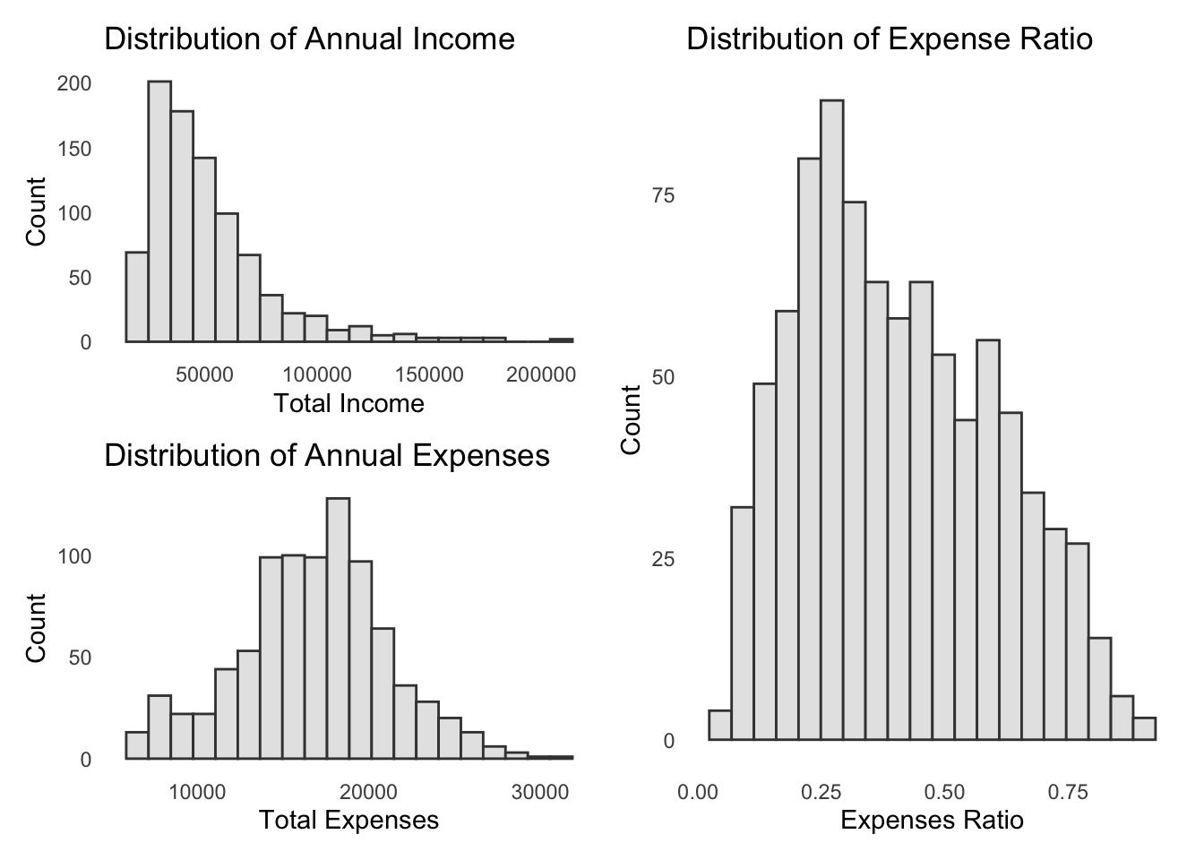
4.2 Exploratory Data Visualisation
4.2.1 Ridgeline Plot
A ridgeline plot is a visualization that displays the distribution of a numeric variable across groups as stacked smoothed curves, helping compare distribution shapes and densities. It provides a compact and visually appealing way to analyze and compare distributions, making it useful for exploring data with multiple categories or groups.
From below, we can observe that:
Participants with higher education level makes higher wages, and that is consistent across all age groups
However, there is no significant changes in wages at every education level.
Participants that live alone (household size = 1) has lower expenses that those with more than 1. However, there is no significant differences between participants with a spouse (household size = 2) and those with kids (household size = 3). In fact, both have the same distribution.
Show the code
combined_pivot_data <- combined_pivot_data %>%
  mutate(AgeGroup = cut(age, breaks = c(0,20, 30, 40, 50, 60), labels = c("<20", "20-30", "30-40", "40-50", "50-60")))

ggplot(combined_pivot_data,
       aes(y = educationLevel,
           x = Wage,
           fill = after_stat(x))) +
  geom_density_ridges_gradient(scale = 3,
                      alpha = 0.8
                      ) +
  scale_fill_viridis_c(name = "Wage",
                       option = "turbo") +
  labs(x = "Wage",
       y = "Education Level",
       title = "Distribution of Wage by Education Level at Age Group {closest_state}") +

  theme(legend.position="none",
  plot.title = element_text(face = "bold", size = 12),
  axis.title.x = element_text(size = 10, hjust = 1),
  axis.title.y = element_text(size = 10),
  axis.text = element_text(size = 8)) +

  transition_states(combined_pivot_data$AgeGroup, transition_length = 0, state_length = 1)+
  theme_minimal()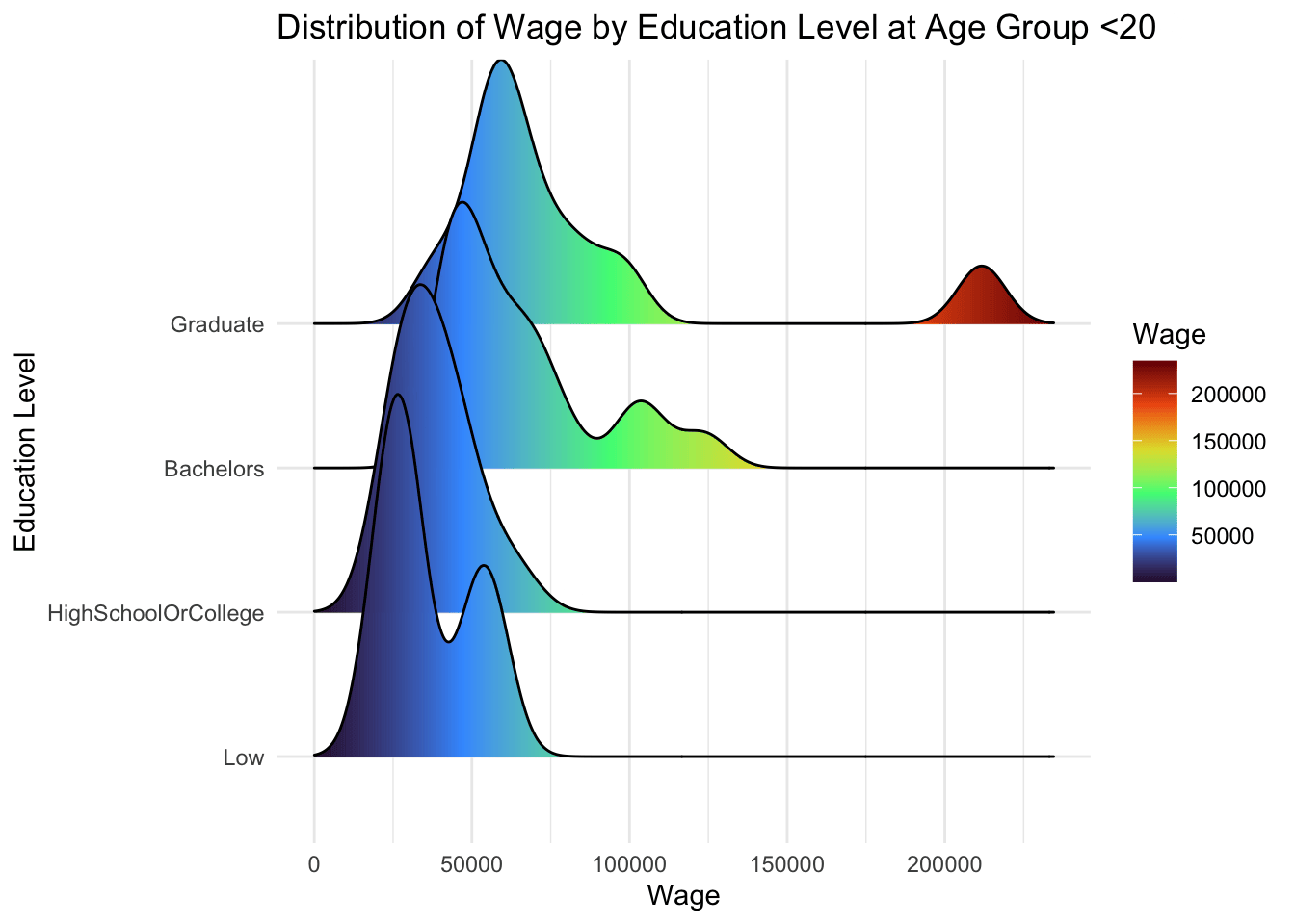
Show the code
ggplot(combined_pivot_data,
       aes(y = householdSize,
           x = total_expenses,
           fill = after_stat(x))) +
  geom_density_ridges_gradient(scale = 3,
                      alpha = 0.8
                      ) +
  scale_fill_viridis_c(name = "Expenses",
                       option = "turbo") +
  labs(x = "Expenses",
       y = "Household Size",
       title = "Distribution of Expenses by Household Size at Age Group {closest_state}") +

  theme(legend.position="none",
  text = element_text(family = "Garamond"),
  plot.title = element_text(face = "bold", size = 12),
  axis.title.x = element_text(size = 10, hjust = 1),
  axis.title.y = element_text(size = 10),
  axis.text = element_text(size = 8)) +

  transition_states(combined_pivot_data$AgeGroup, transition_length = 0, state_length = 1)+
  theme_minimal()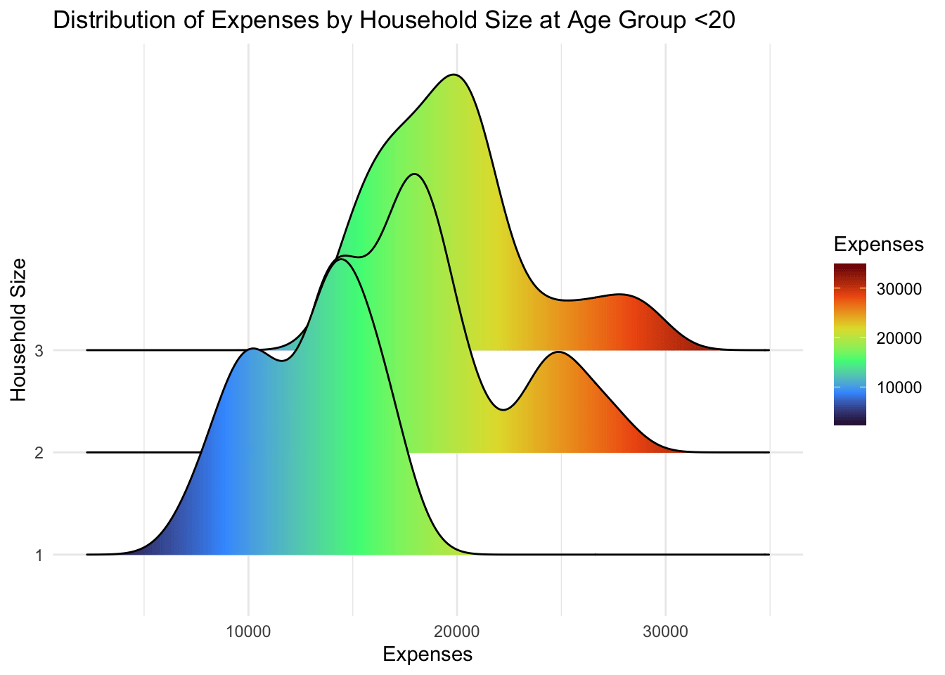
4.2.2 Interactive Scatter Plot
Scatter plots display the relationship between two continuous variables as a collection of individual data points on a two-dimensional plane. The below visualisation focus on Joviality score as the y-axis variable, to observe the relationship with other variables. It allows the City Planners to select the x-axis of the variables they wish to study.
For x-axis, we selected Annual Income, Annual Expense, Recreation Expenses, Expense Ratio, and Age. This is to discover patterns of user’s financial behavior versus their happiness level. Recreation Expenses is the only expense category chosen as it is assumed that it is the only one which doesn’t cover the basic needs (according to Maslow’s Hierarchy of Needs!).
As the below scatterplot is only plotted for visualisation and not for statistical inquiries (which we would do below at a later section!), plot_ly is used to prepare the interactive plot.
In order to prepare a dynamic chart for users to interact and change the variables, updatemenus argument is parsed.
Users can also hover over the plots to see the tooltip.
Show the code
#Base plot
plot_ly(data = combined_pivot_data,
        x = ~total_income,
        y = ~joviality,
        hovertemplate = ~paste("<br>Age:", age,
                               "<br>Total Income", total_income,
                               "<br>Total Expenses:", total_expenses,
                               "<br>Expense Ratio:", Expense_ratio),
        type = 'scatter',
        mode = 'markets',
        marker = list(opacity = 0.7,
                      color = '#00BFC4',
                      line = list(width = 0.2, color = 'white'))) |>

  layout(title = list(text="<b>Interactive scatterplot of participants'\nTotal Annual Income vs Joviality Score</b>", font = list(size = 14)),
         xaxis = list(title = "Total Annual Inncome"),
         yaxis = list(title = "Joviality Score"),

#creating dropwdown menus to allow selection of parameters on x-axis and y-axis
         updatemenus = list(list(type = "dropdown",
                                 direction = "up",
                                 xref = "paper",
                                 yref = "paper",
                                 xanchor = "left",
                                 yanchor = "top",
                                 x = 1,
                                 y = 0,
                                 buttons = list(
                                   list(method = "update",
                                        args = list(list(x = list(combined_pivot_data$total_income)),
                                                    list(xaxis = list(title = "Total Annual Income"))),
                                        label = "Annual Income"),
                                   list(method = "update",
                                        args = list(list(x = list(combined_pivot_data$total_expenses)),
                                                    list(xaxis = list(title = "Total Annual Expenses"))),
                                        label = "Annual Expenses"),
                                   list(method = "update",
                                        args = list(list(x = list(abs(combined_pivot_data$Recreation))),
                                                    list(xaxis = list(title = "Recreation Expenses"))),
                                        label = "Recreation Expenses"),
                                   list(method = "update",
                                        args = list(list(x = list(combined_pivot_data$Expense_ratio)),
                                                    list(xaxis = list(title = "Expense Ratio"))),
                                        label = "Expense Ratio"),
                                   list(method = "update",
                                        args = list(list(x = list(combined_pivot_data$age)),
                                                    list(xaxis = list(title = "Age"))),
                                        label = "Age")
                                   )
                                 )
                            )
         )
From above, we can observe and draw following insights:
Annual Income has no positive correlation (in fact, somewhat negative!) with Joviality Score. In fact, participants that are drawing high income have lower joviality score.
Total Expenses, Recreation Expenses and Expense Ratio have positive correlation with Joviality Score.
There are no correlation between Age and Joviality Score.
4.2.3 Interactive Violin plot
A Violin plot, is a graphical representation of the distribution of a continuous variable through quartiles. It is generally used to discover relationship between continuous and discrete variables, and allow for the visualisation of kernel density.
The below visualisation also allow City Planners to select the x-axis and y-axis they intend to study.
For y-axis, Joviality, Total Annual Income and Expense Ratio are chosen. For x-axis, categorical and discrete variables are chosen. These include Age Group, Education Level, Household size, whether participants Have Kids?, Income Level, and Interest Group.
Income Level is a new variable that is added to the data set. It is derived by breaking down the Total Annual Income of participants into 4 different quantiles, and respectively named as {“Low”, “Medium”, “High”, “Very High”}.
Similar to the scatterplot, plot_ly is used to prepare the interactive plot.
Show the code
# Define the income levels based on quantiles
income_levels <- quantile(combined_pivot_data$total_income, probs = c(0, 0.25, 0.5, 0.75, 1))

# Add a new column with income levels
combined_pivot_data <- combined_pivot_data %>%
  mutate(income_level = factor(cut(total_income, breaks = income_levels, include.lowest = TRUE, labels = c("Low", "Medium", "High", "Very High"),ordered = TRUE)))

#Base plot
plot_ly(data = combined_pivot_data,
        x = ~AgeGroup,
        y = ~joviality,
        line = list(width =1),
        type = "violin",
        marker = list(opacity = 0.5,
          line = list(width = 2)),
        box = list(visible = T),
        meanline = list(visible = T,
                        color = "red",
                        width = 2)) |>

  layout(title = list(text="<b>Distribution of Joviality by Age Group</b>", font = list(size = 14)),
         xaxis = list(title = "Total Annual Inncome"),
         yaxis = list(title = "Joviality Score"),

#creating dropwdown menus to allow selection of parameters on x-axis
         updatemenus = list(list(type = 'dropdown',
                                 direction = 'up',
                                 xref = "paper",
                                 yref = "paper",
                                 xanchor = "left",
                                 yanchor = "top",
                                 x = 1,
                                 y = 0,
                                 buttons =
                                   list(
                                   list(method = "update",
                                        args = list(list(x = list(combined_pivot_data$AgeGroup)),
                                                    list(xaxis = list(title = "Age Group"))),
                                        label = "Age Group"),
                                   list(method = "update",
                                        args = list(list(x = list(combined_pivot_data$educationLevel)),
                                                    list(xaxis = list(title = "Education Level", categoryorder = "mean ascending"))),                                        label = "Education Level"),
                                   list(method = "update",
                                        args = list(list(x = list(combined_pivot_data$householdSize)),
                                                    list(xaxis = list(title = "Household Size"))),
                                        label = "Household Size"),
                                   list(method = "update",
                                        args = list(list(x = list(combined_pivot_data$haveKids)),
                                                    list(xaxis = list(title = "Have Kids"))),
                                        label = "Have Kids?"),
                                   list(method = "update",
                                        args = list(list(x = list(combined_pivot_data$income_level)),
                                                    list(xaxis = list(title = "Income Level", categoryorder = "mean descending"))),
                                        label = "Income Level"),
                                   list(method = "update",
                                        args = list(list(x = list(combined_pivot_data$interestGroup)),
                                                    list(xaxis = list(title = "Interest Group", categoryorder = "mean descending"))),
                                        label = "Interest Group")


                                 )
                                 ),
                            list(type = "dropdown",
                                 xref = "paper",
                                 yref = "paper",
                                 xanchor = "left",
                                 yanchor = "top",
                                 x = 0,
                                 y = 1.05,
                                 buttons = list(
                                   list(method = "update",
                                        args = list(list(y = list(combined_pivot_data$joviality)),
                                                    list(yaxis = list(title = "Joviality", categoryorder = "category ascending"))),
                                        label = "Joviality"),
                                   list(method = "update",
                                        args = list(list(y = list(combined_pivot_data$Expense_ratio)),
                                                    list(yaxis = list(title = "Expense Ratio"))),
                                        label = "Expense Ratio"),
                                   list(method = "update",
                                        args = list(list(y = list(combined_pivot_data$total_income)),
                                                    list(yaxis = list(title = "Total Annual Income"))),
                                        label = "Total Annual Income")
                                   )
                                 )
                            )
         )
From above, we can observe and draw following insights:
For Joviality Score, there is minimal difference between the means/medians when plotted against all other variables except Education Level. The violin plot reveals lower mean/median for Jovality Score for higher education levels compared to lower one.
For Expense Ratio, similarly, there is minimal difference between the means/medians of most variables. In this case, only Education Level and Income Level was observed to have largely different means/medians across the group. Participants with low Education Level have higher expense ratio mean/median that those with higher Education Level. The other observation is that among the participants, those with very high Income Level had much lower mean/median expense ratio, indicating a much higher saving ratio that those with low Income Level, which could indicate that those with high spending power are not spending as much as they are expected to.
For Total Annual Income, there’s no surprise that again, only when plotted against Education Level did we observe a difference in means/medians of the groups. Participants with higher Education Level earned more on a annual basis than those with low Education Level. Those with low education level has much lower variance, whereas those with high education level observed wider variances.
4.3 Visualising Uncertainty
Visualizing uncertainty in data is a challenging task in data visualization. Often, we interpret data points as precise representations of true values, neglecting the inherent uncertainty. Hence, it is important to note these uncertainties either in error bars or confidence bands.
The below visualisation uses stat_pointinterval() of ggdist package to build a visual of displaying distribution of different variables.
Based on the insights and observation from the above exploratory data visualization, we selected the key variables such as Education Level, Total Income, Total Expense and Expense Ratio to visualise the uncertainties.
Show the code
combined_pivot_data %>%
  ggplot(aes(x = educationLevel,
             y = total_income)) +

  stat_pointinterval(
    aes(interval_color = stat(level)),
    .width = c(0.95, 0.99),
    .point = mean,
    .interval = qi,
    point_color = "darkred",
    show.legend = FALSE) +

  #Defining the color of the intervals
  scale_color_manual(
    values = c("blue2", "darkgreen"),
    aesthetics = "interval_color") +

  labs(
    title = "Visualising uncertainty in mean estimates of Total Annual income\nby Education Level",
    subtitle = "95% and 99% quantiles intervals at mean point",
    x = "Education level",
    y = "Annual Income") +

   theme_minimal() +

  theme(plot.title = element_text(face = "bold", size = 12),
        plot.subtitle = element_text(size = 10),
        axis.text.x = element_text(hjust = 1))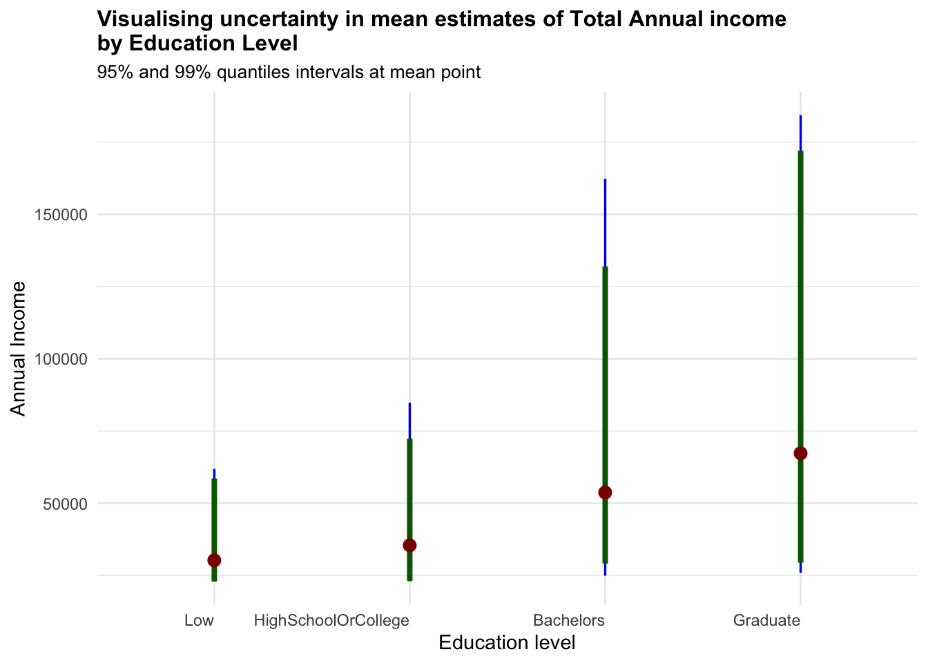
Show the code
combined_pivot_data %>%
  ggplot(aes(x = educationLevel,
             y = Expense_ratio)) +

  stat_pointinterval(
    aes(interval_color = stat(level)),
    .width = c(0.95, 0.99),
    .point = mean,
    .interval = qi,
    point_color = "darkred",
    show.legend = FALSE) +

  #Defining the color of the intervals
  scale_color_manual(
    values = c("blue2", "darkgreen"),
    aesthetics = "interval_color") +

  labs(
    title = "Visualising uncertainty in mean estimates of Expense Ratio\nby Education Level",
    subtitle = "95% and 99% quantiles intervals at mean point",
    x = "Education level",
    y = "Expense Ratio") +

   theme_minimal() +

  theme(plot.title = element_text(face = "bold", size = 12),
        plot.subtitle = element_text(size = 10),
        axis.text.x = element_text(hjust = 1))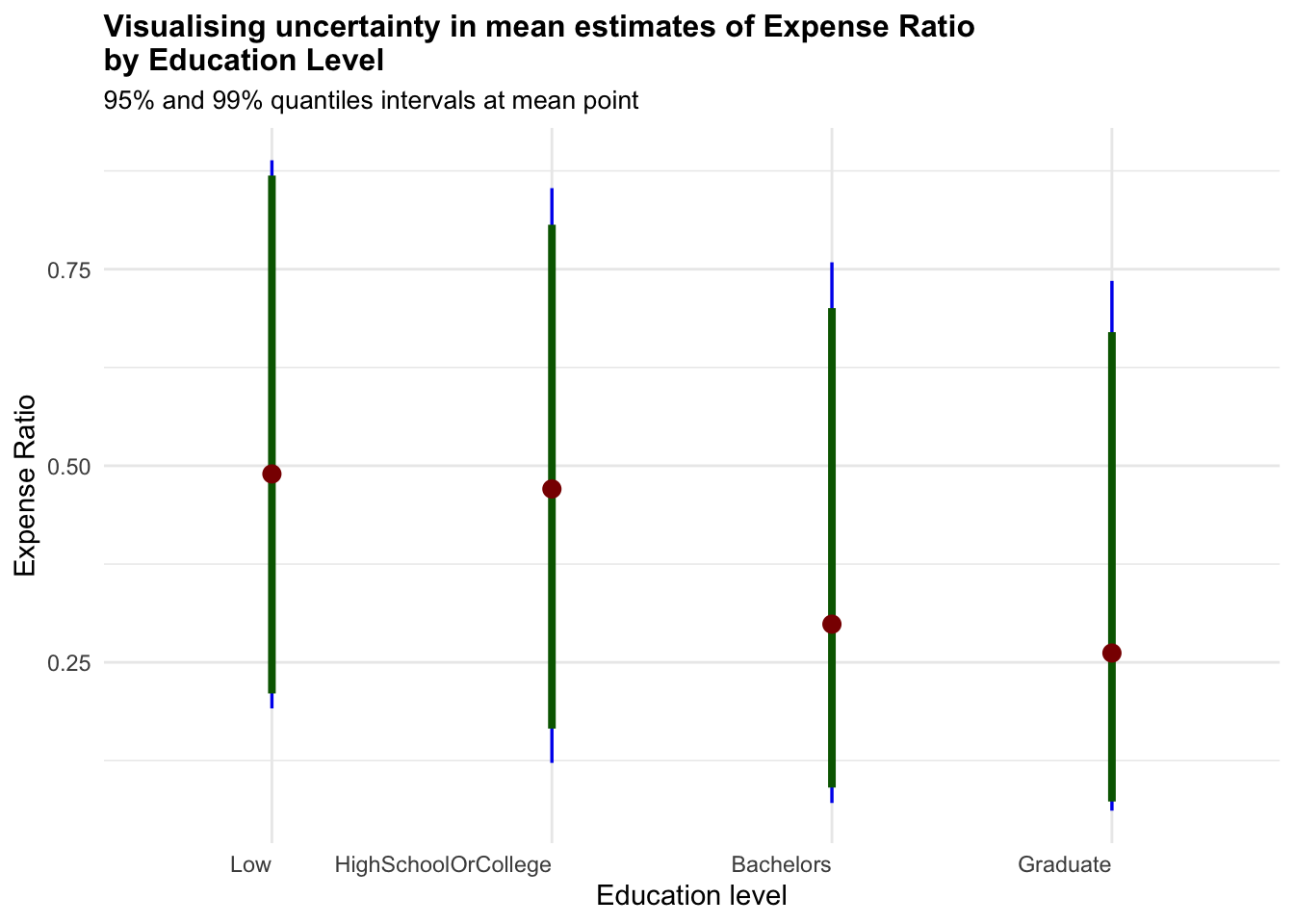
Show the code
combined_pivot_data %>%
  ggplot(aes(x = income_level,
             y = joviality)) +

  stat_pointinterval(
    aes(interval_color = stat(level)),
    .width = c(0.95, 0.99),
    .point = mean,
    .interval = qi,
    point_color = "darkred",
    show.legend = FALSE) +

  #Defining the color of the intervals
  scale_color_manual(
    values = c("blue2", "darkgreen"),
    aesthetics = "interval_color") +

  labs(
    title = "Visualising uncertainty in mean estimates of Joviality\nby Income Level",
    subtitle = "95% and 99% quantiles intervals at mean point",
    x = "Income level",
    y = "Joviality") +

   theme_minimal() +

  theme(plot.title = element_text(face = "bold", size = 12),
        plot.subtitle = element_text(size = 10),
        axis.text.x = element_text(hjust = 1))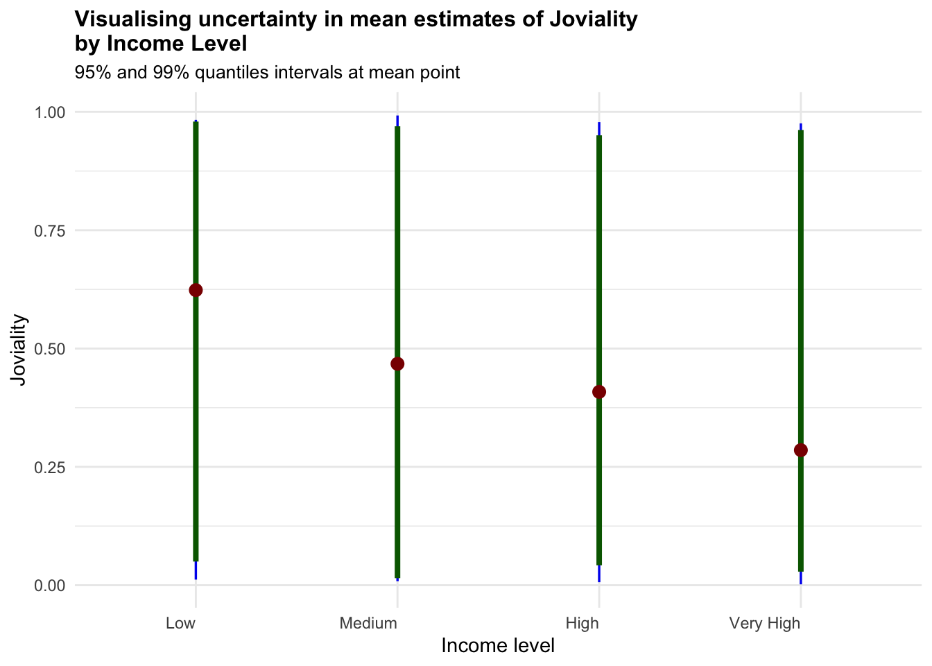
Show the code
combined_pivot_data %>%
  ggplot(aes(x = interestGroup,
             y = Recreation)) +

  stat_pointinterval(
    aes(interval_color = stat(level)),
    .width = c(0.95, 0.99),
    .point = mean,
    .interval = qi,
    point_color = "darkred",
    show.legend = FALSE) +

  #Defining the color of the intervals
  scale_color_manual(
    values = c("blue2", "darkgreen"),
    aesthetics = "interval_color") +

  labs(
    title = "Visualising uncertainty in mean estimates of Recreation Expenses\nby Interest Group",
    subtitle = "95% and 99% quantiles intervals at mean point",
    x = "Interest Group",
    y = "Recreation") +

   theme_minimal() +

  theme(plot.title = element_text(face = "bold", size = 12),
        plot.subtitle = element_text(size = 10),
        axis.text.x = element_text(hjust = 1))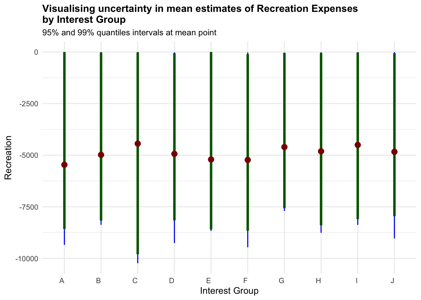
As noted from previous section, the only worthy insights drawn here is that higher Education Level have higher uncertainties in terms for Total Annual Income.
4.4 Correlation Analysis
Next, we plot a correlation chart to compare the different variables. The correlation charts illustrate that there is a positive relationship between Total Expenses and Joviality, as well as Recreation Expenses and Joviality, with Total Expenses having a stronger correlation. That is, the more a user spends, the happier they are. This is previously noted in Section 4.2.2 as well. However, there is a weak positive relationship between Income and Recreation Expenses - that is, the intuitive notion that as one’s spending power increases, one would be spending more on recreation activities is not exactly true.
Show the code
ggscatterstats(
  data = combined_pivot_data,
  x = total_income,
  y = Recreation,
  marginal = FALSE,
  )+

  theme_minimal() +

  labs(title = 'Correlation of Income and Recreation Expenses', x = "Annual Income", y = "Recreation Expenses")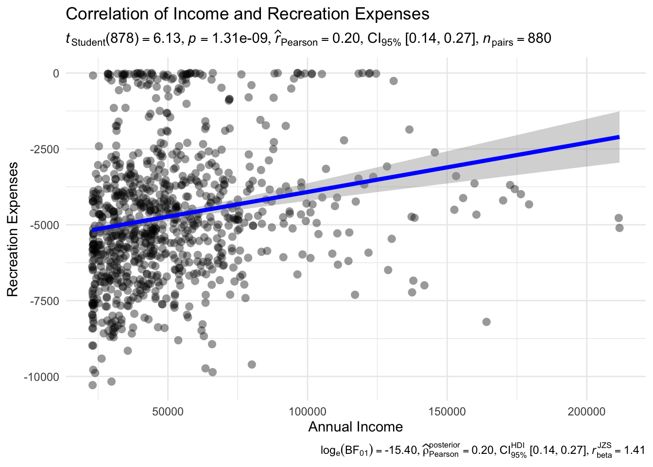
Show the code
ggscatterstats(
  data = combined_pivot_data,
  x = Recreation,
  y = joviality,
  marginal = FALSE,
  ) +

  theme_minimal() +

  labs(title = 'Correlation of Recreation Expense and Joviality Score', x = "Recreation Expenses", y = "Joviality")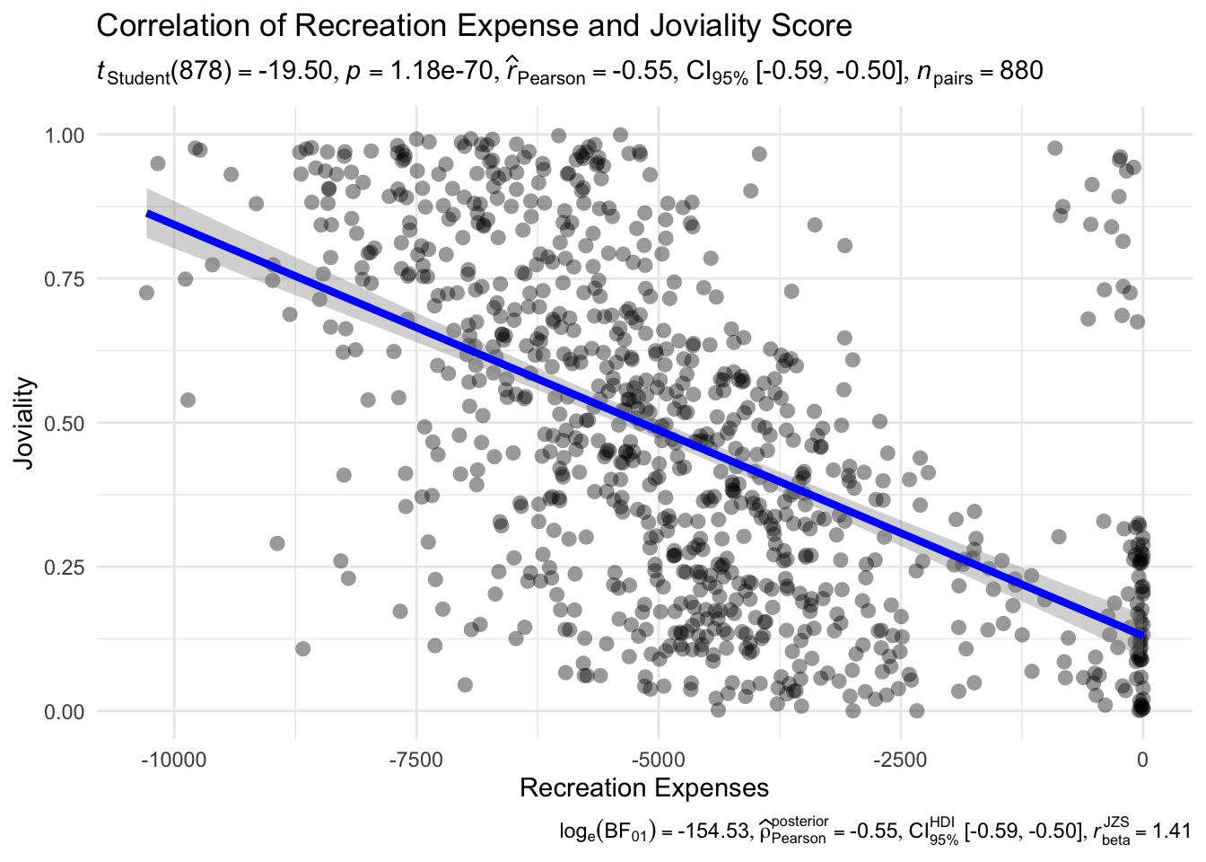
Show the code
        axis.title = element_text(size = 12, face = "bold") +
  theme(text = element_text(family = "Garamond"),
        plot.title = element_text(hjust = 0.2, size = 15, face = 'bold'))
Show the code
ggscatterstats(
  data = combined_pivot_data,
  x = total_expenses,
  y = joviality,
  marginal = FALSE,
  ) +

  theme_minimal() +

  labs(title = 'Correlation of Total Expense and Joviality Score', x = "Total Expenses", y = "Joviality")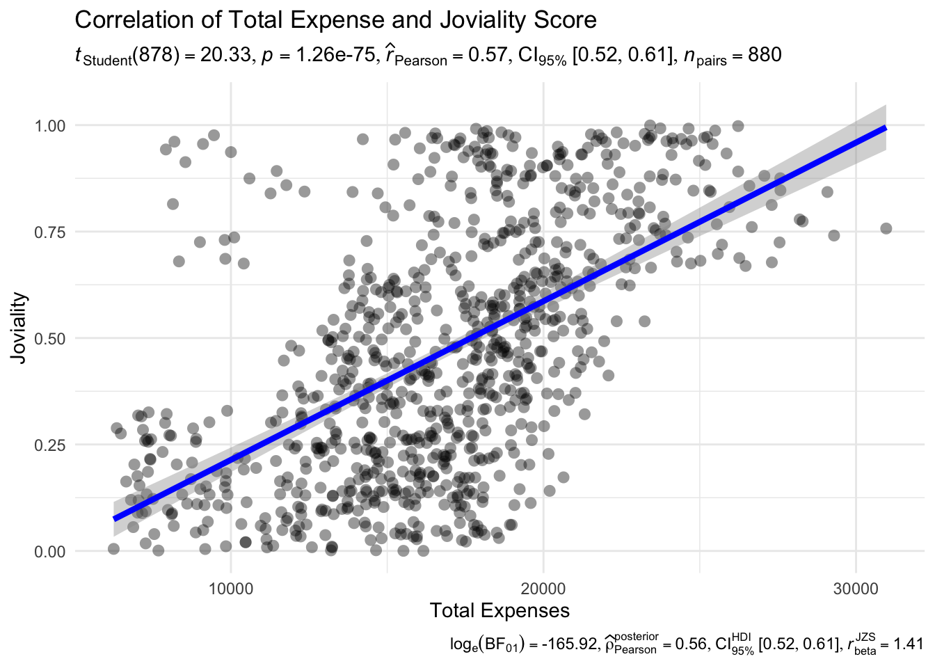
Show the code
axis.title = element_text(size = 12, face = "bold") 4.5 Further analysis - Low Income Family
We wanted to further look into visualising the expenditures of low income family, as this could be an area of interest for City Planners with regards to awarding grants.
Hence, below, we plot a histogram for each of the expense category, where participants from low-income family spend a percentage of their expenses from.
The histogram is plotted with ggplot while the coordinated multiple views is augmented with ggiraph.
Show the code
# Filter the dataset for low-income participants
low_income_data <- combined_pivot_data[combined_pivot_data$income_level == "Low", ]

# Calculate the total expenses for each participant
low_income_data$total_expenses <- rowSums(low_income_data[, c("Recreation", "Shelter", "Food", "Education")])

# Calculate the percentage spent on recreation for each participant
low_income_data$Recreation_pct <- low_income_data$Recreation / low_income_data$total_expenses * 100
low_income_data$Shelter_pct <- low_income_data$Shelter / low_income_data$total_expenses * 100
low_income_data$Food_pct <- low_income_data$Food / low_income_data$total_expenses * 100
low_income_data$Education_pct <- low_income_data$Education / low_income_data$total_expenses * 100

# Combine the three histograms into one plot
ggplot(low_income_data) +
  geom_histogram(aes(x = Recreation_pct, fill = "Recreation"), binwidth = 5, alpha = 0.5) +
  geom_histogram(aes(x = Shelter_pct, fill = "Shelter"), binwidth = 5, alpha = 0.5) +
  geom_histogram(aes(x = Food_pct, fill = "Food"), binwidth = 5, alpha = 0.5) +
  geom_histogram(aes(x = Education_pct, fill = "Education"), binwidth = 5, alpha = 0.5) +
  scale_fill_manual(values = c("Recreation" = "steelblue", "Shelter" = "orange", "Food" = "green", "Education" = "yellow")) +
  labs(x = "Percentage over Total Expenses", y = "Number of Participants", fill = "Expense Category") +
  ggtitle("Distribution of Percentage Spent on Expenses (Low Income)") +
  theme_minimal()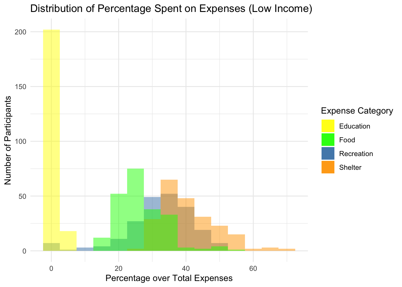
Show the code
p1 <- ggplot(data=low_income_data,
       aes(x = Recreation_pct)) +
  geom_dotplot_interactive(
    aes(data_id = participantId),
    stackgroups = TRUE,
    binwidth = 1,
    method = "histodot") +
  coord_cartesian(xlim=c(0,60)) +
  scale_y_continuous(NULL,
                     breaks = NULL)

p2 <- ggplot(data=low_income_data,
       aes(x = Shelter_pct)) +
  geom_dotplot_interactive(
    aes(data_id = participantId),
    stackgroups = TRUE,
    binwidth = 1,
    method = "histodot") +
  coord_cartesian(xlim=c(0,60)) +
  scale_y_continuous(NULL,
                     breaks = NULL)
p3 <- ggplot(data=low_income_data,
       aes(x = Food_pct)) +
  geom_dotplot_interactive(
    aes(data_id = participantId),
    stackgroups = TRUE,
    binwidth = 1,
    method = "histodot") +
  coord_cartesian(xlim=c(25,80)) +
  scale_y_continuous(NULL,
                     breaks = NULL)
p4 <- ggplot(data=low_income_data,
       aes(x = Education_pct)) +
  geom_dotplot_interactive(
    aes(data_id = participantId),
    stackgroups = TRUE,
    binwidth = 1,
    method = "histodot") +
  coord_cartesian(xlim=c(0,60)) +
  scale_y_continuous(NULL,
                     breaks = NULL)

girafe(code = print(p1 / p2 | p3 / p4),
       width_svg = 8,
       height_svg = 8,
       options = list(
         opts_hover(css = "fill: #202020;"),
         opts_hover_inv(css = "opacity:0.2;")
         )
       )
From the above, we could observe that low income family participants are still allocating a larger proportion of their expenses to Recreation expenses, and more so than food.