pacman::p_load(ggrepel, patchwork,
               ggthemes, hrbrthemes,
tidyverse) Hands-on_Ex02
Check packages
Load Data
exam_data <- read_csv("data/Exam_data.csv")Rows: 322 Columns: 7
── Column specification ────────────────────────────────────────────────────────
Delimiter: ","
chr (4): ID, CLASS, GENDER, RACE
dbl (3): ENGLISH, MATHS, SCIENCE
ℹ Use `spec()` to retrieve the full column specification for this data.
ℹ Specify the column types or set `show_col_types = FALSE` to quiet this message.ggplot(data=exam_data, aes(x = MATHS, y = ENGLISH)) +
geom_point() +
geom_smooth(method=lm,
linewidth=0.5) +
geom_label_repel(aes(label = ID)) +
coord_cartesian(xlim=c(0,100),
ylim=c(0,100)) +
ggtitle("English scores versus Maths scores for Primary 3")`geom_smooth()` using formula = 'y ~ x'Warning: ggrepel: 317 unlabeled data points (too many overlaps). Consider
increasing max.overlaps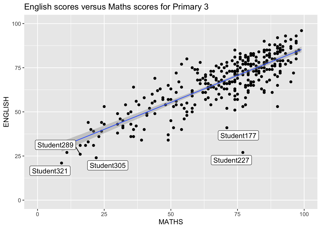
ggplot(data=exam_data,
             aes(x = MATHS)) +
  geom_histogram(bins=20,
                 boundary = 100,
                 color="grey25",
                 fill="grey90") +
  ggtitle("Distribution of Maths scores") +
  theme_wsj() +
  theme(plot.title = element_text(size = 25))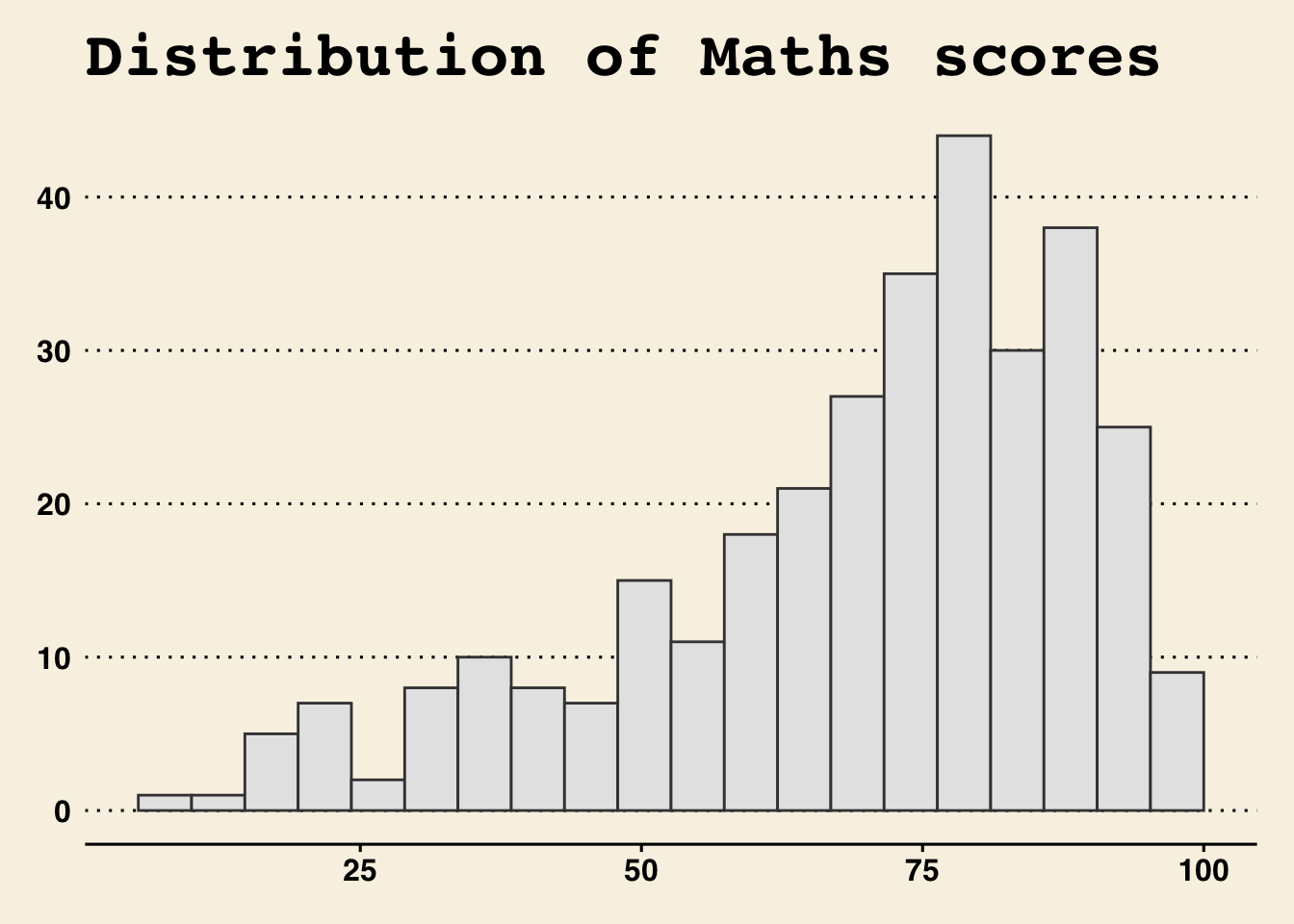
ggplot(data=exam_data,
             aes(x = MATHS)) +
  geom_histogram(bins=20,
                 boundary = 100,
                 color="grey25",
                 fill="grey90") +
  ggtitle("Distribution of Maths scores") +
  theme_ipsum(axis_title_size = 18,
              base_size = 15,
              grid = "Y")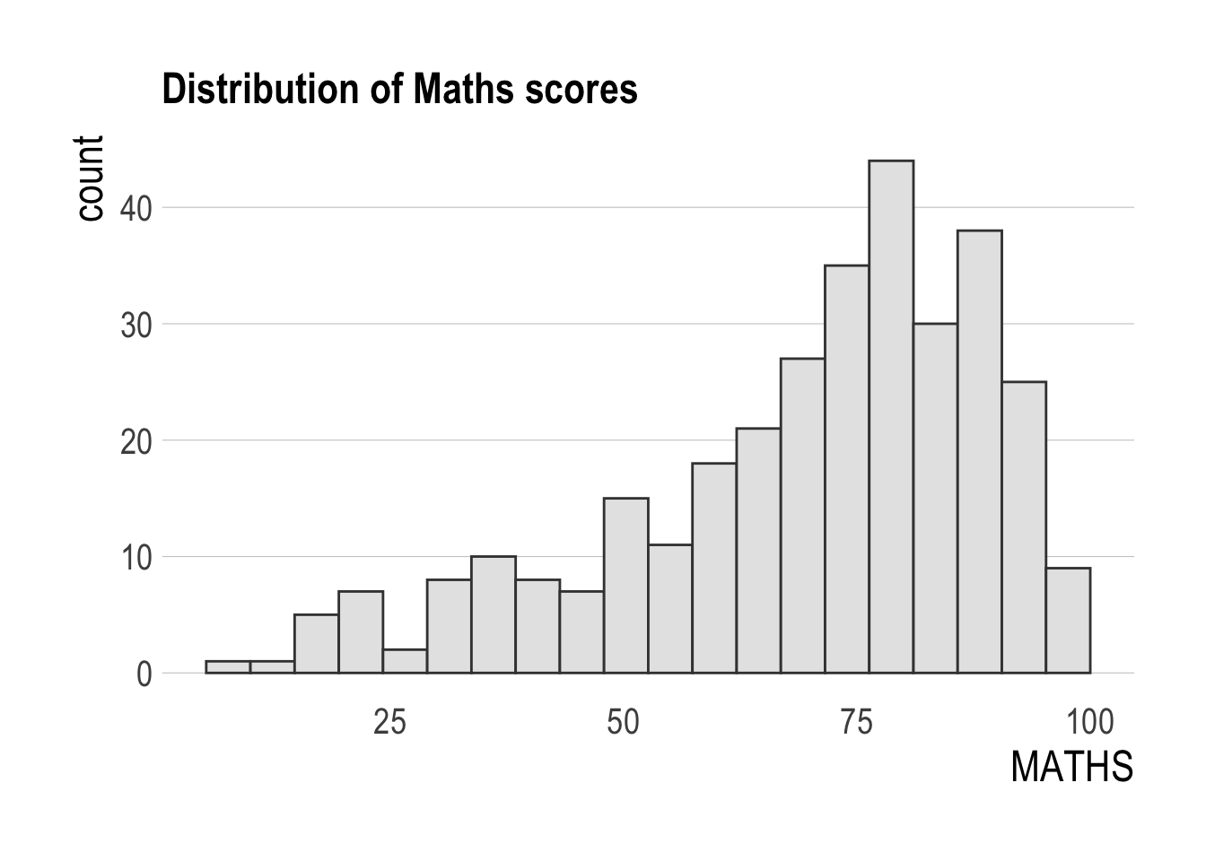
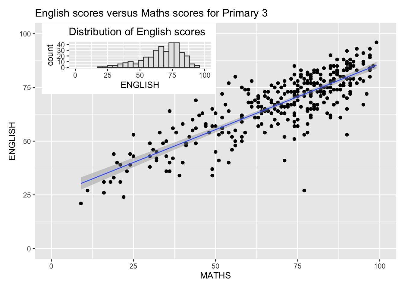
p1 <- ggplot(data=exam_data,
             aes(x = MATHS)) +
  geom_histogram(bins=20,
                 boundary = 100,
                 color="grey25",
                 fill="grey90") +
  coord_cartesian(xlim=c(0,100)) +
  ggtitle("Distribution of Maths scores")
p2 <- ggplot(data=exam_data,
aes(x = ENGLISH)) +
geom_histogram(bins=20,
boundary = 100,
color="grey25",
fill="grey90") +
coord_cartesian(xlim=c(0,100)) +
ggtitle("Distribution of English scores")p3 <- ggplot(data=exam_data,
aes(x= MATHS,
y=ENGLISH)) +
geom_point() +
geom_smooth(method=lm,
size=0.5) +
coord_cartesian(xlim=c(0,100),
ylim=c(0,100)) +
ggtitle("English scores versus Maths scores for Primary 3")Warning: Using `size` aesthetic for lines was deprecated in ggplot2 3.4.0.
ℹ Please use `linewidth` instead.(p1 / p2 | p3) +
plot_annotation(tag_levels = 'I')`geom_smooth()` using formula = 'y ~ x'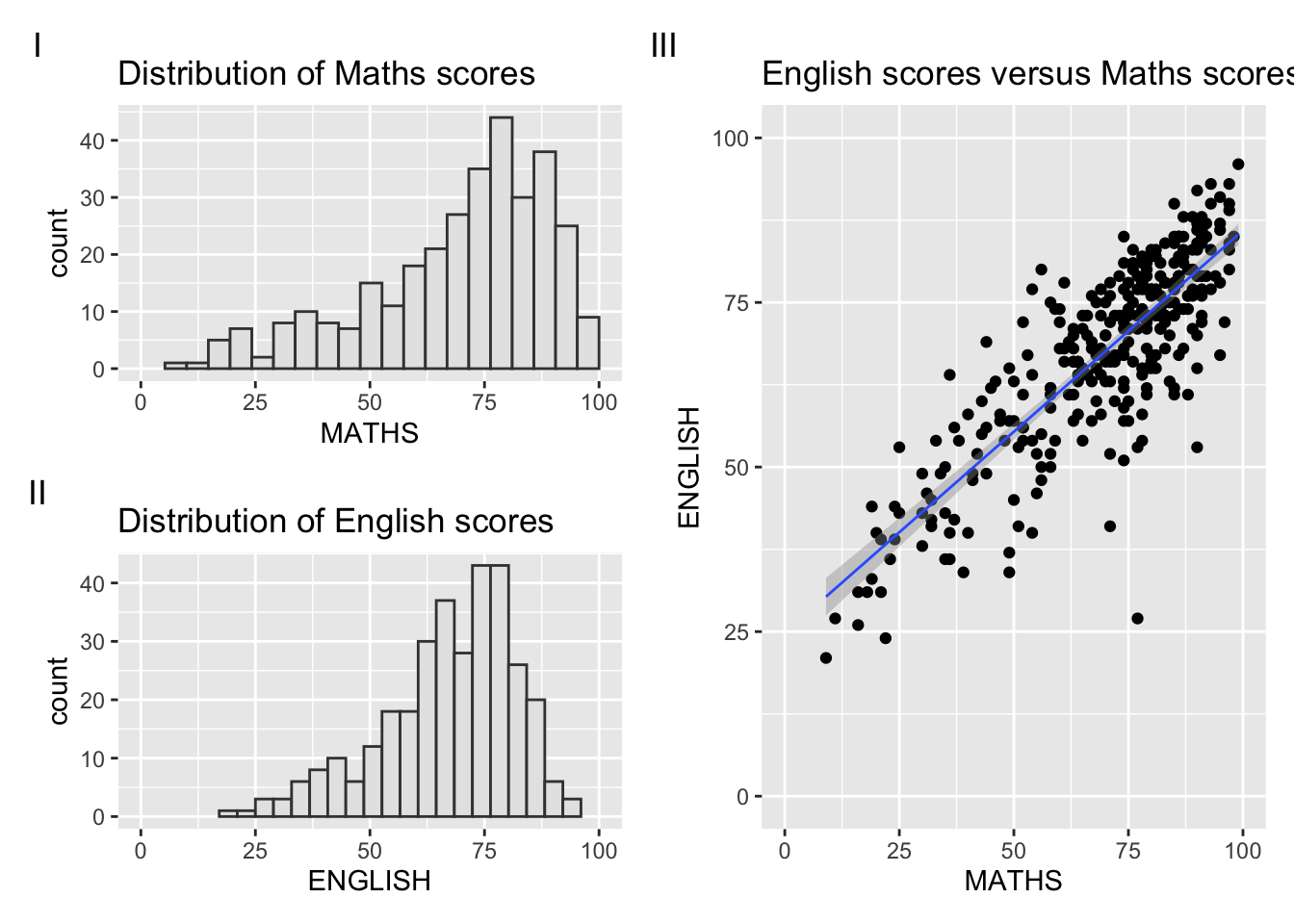
p3 + inset_element(p2,
                   left = 0.02,
                   bottom = 0.7,
                   right = 0.5,
                   top = 1)
`geom_smooth()` using formula = 'y ~ x'